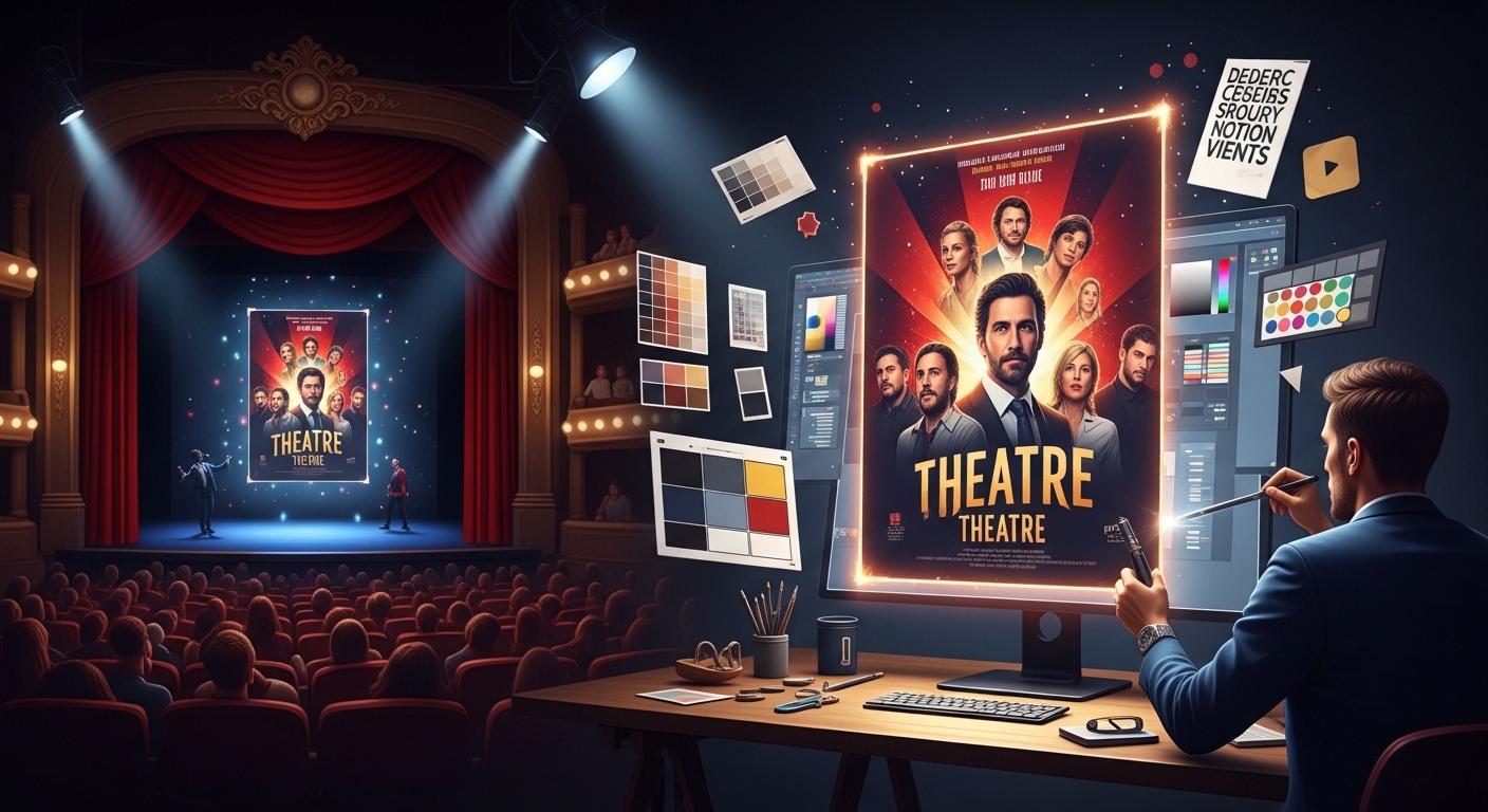
A theatre poster is not just a piece of promotional artwork—it is a conversion tool. Its job is not merely to look attractive but to compel a passerby to stop, register curiosity, and ultimately feel motivated enough to attend a performance. In an environment where audiences are constantly exposed to digital ads, event listings, and entertainment options, a theatre poster has only a few seconds to make an impact.
In 2026, when attention spans are shorter and visual competition is intense, designing effective theatre posters has become more strategic than ever. The most successful posters do not rely on decoration alone; they are built on psychology, visual hierarchy, emotional triggers, and clarity of message. A poorly designed poster may go unnoticed, while a strong one can directly influence ticket sales and seat occupancy.
Understanding how to design theatre posters that actually fill seats requires looking beyond aesthetics and focusing on how people interpret visual information in public spaces.
Understanding the Purpose of a Theatre Poster
Before thinking about colors, fonts, or layouts, it is essential to understand what a theatre poster is trying to achieve. Unlike general artwork, a theatre poster operates in a performance-driven context where every design decision must support audience conversion.
A theatre poster typically has three core objectives. First, it must attract attention in a crowded visual environment. Second, it must communicate essential information quickly, such as the name of the production, the tone of the performance, and the time or venue. Third, it must create enough emotional interest for someone to take action, whether that means scanning a QR code, searching online, or buying a ticket.
The challenge lies in balancing artistic expression with functional clarity. A poster that is too abstract may fail to communicate, while one that is too informational may fail to inspire curiosity. The most effective designs sit in the space between these two extremes.
Visual Hierarchy: Guiding the Viewer’s Eye
One of the most important principles in theatre poster design is visual hierarchy. This refers to the way information is arranged so that the viewer naturally sees the most important elements first.
When someone looks at a poster, they do not read it in order—they scan it. This scanning behavior typically starts with the largest visual element, often an image or title, and moves downward toward supporting details. If the hierarchy is not clear, the message becomes confusing and the viewer loses interest quickly.
A strong theatre poster usually prioritizes the production title or central visual concept at the top or center. Supporting information such as dates, venue, and cast details should be secondary, placed in a way that does not compete for attention but remains accessible.
The goal is to control the reading path without forcing it. When visual hierarchy is well executed, the viewer understands the message within seconds, even without consciously reading everything.
Emotional Design and Storytelling Through Imagery
Theatre is inherently emotional, and a successful poster must reflect that emotional depth. Unlike commercial advertisements that focus on products, theatre posters are selling an experience—something abstract, narrative-driven, and emotionally charged.
Imagery plays a central role in this process. A single visual concept can communicate genre, tone, and mood instantly. For example, a dark, high-contrast composition with sharp lighting may suggest drama or thriller themes, while softer colors and expressive faces may indicate romance or human-centered storytelling.
The key is not to overload the poster with multiple ideas but to focus on a single emotional direction. A cluttered visual narrative confuses the viewer, while a focused one creates curiosity. That curiosity is what drives ticket interest.
In many cases, audiences decide whether to attend a performance based on emotional resonance rather than detailed information. A poster that successfully captures emotion often outperforms one that simply lists facts clearly.
Typography: The Silent Communicator of Tone
Typography is one of the most underestimated elements in theatre poster design. Fonts do not just carry information—they carry personality. The typeface chosen for a poster can instantly communicate whether a production is modern, classical, experimental, humorous, or dramatic.
For example, bold serif fonts often suggest tradition and seriousness, making them suitable for classical theatre or historical performances. Clean sans-serif fonts tend to feel modern and accessible, often used for contemporary productions. Stylized or artistic fonts can convey experimental or avant-garde themes, but they must be used carefully to avoid reducing readability.
The most important rule in typography is clarity. No matter how artistic a font is, if it cannot be read quickly from a distance, it fails its primary purpose. Theatre posters are often viewed in motion—on streets, in corridors, or on digital screens—so readability must always come first.
Color Psychology and Audience Attraction
Color is one of the fastest ways to influence perception. In theatre poster design, color choices are rarely arbitrary. They are tied directly to emotional tone and audience expectation.
Dark tones such as black, deep red, or navy blue are often associated with intensity, suspense, or drama. Brighter palettes like yellow, orange, or pastel tones suggest lighter themes such as comedy or romance. However, the effectiveness of color is not just about emotion—it is also about contrast and visibility.
A theatre poster must stand out in environments filled with competing visuals. High contrast between background and text improves readability and ensures the poster is noticeable even from a distance. Subtle color choices may look elegant in isolation but fail in real-world viewing conditions.
Effective designers often combine emotional color psychology with practical visibility principles to create posters that are both attractive and functional.
Composition and Layout Strategy
Composition refers to how elements are arranged within the poster space. A well-composed theatre poster feels balanced, intentional, and easy to understand. A poorly composed one feels chaotic or visually overwhelming.
The most effective layouts typically follow a structured flow where one dominant visual element leads the design, supported by secondary text elements arranged around it. Negative space is equally important, as it allows the viewer’s eye to rest and prevents information overload.
Good composition ensures that even if someone only glances at the poster for a second, they still absorb the core message. This is crucial in public environments where attention is fleeting.
Conversion Thinking: Designing for Ticket Sales, Not Just Aesthetics
Strong theatre posters operate more like decision systems than artworks. They guide the viewer through a controlled flow that moves from visibility to understanding, then from understanding to urgency, and finally into action.
At a practical level, this means the poster must perform three jobs extremely quickly:
- Capture attention instantly in a crowded visual environment
- Communicate essential meaning without requiring interpretation
- Reduce friction between interest and ticket purchase
Each of these steps is structural, not decorative. If any one fails, conversion drops sharply regardless of aesthetic quality.
Attention is usually driven by a single dominant visual element—something that immediately interrupts scanning behavior. This could be a strong character image, a striking contrast, or a bold conceptual visual. What matters is not complexity but clarity of focal point.
Once attention is captured, clarity takes priority over style. The viewer should not need to interpret what the poster means. In a matter of seconds, they should understand:
- what the performance is
- what emotional tone it carries
- when it is happening
If any of these require effort to decode, engagement weakens immediately.
After clarity, conversion depends on urgency. This is where many posters underperform. Urgency is not about aggressive messaging; it is about structured limitation. A fixed date range or clearly defined performance window changes how the viewer perceives time.
For example, “this weekend only” carries a different psychological weight than a generic schedule listing. It narrows the decision window and reduces postponement behavior.
Finally, action must be effortless. This is where design either completes or loses the conversion loop.
To make this effective in real-world conditions, the action pathway must be obvious and frictionless:
- QR codes should be placed where the eye naturally lands after reading key information
- Ticket instructions should be minimal and direct, not descriptive
- Links or booking cues should not compete with visual elements
If a viewer has interest but cannot immediately understand how to act, the opportunity decays within seconds.
Real-World Impact: Why Some Posters Sell More Tickets
In real theatre marketing environments, poster performance is not decided by artistic sophistication. It is decided by how efficiently the design translates visual attention into understanding—and understanding into action.
A theatre poster is not viewed in isolation or in a controlled setting. It is seen in motion: walking audiences, scrolling users, distracted viewers. That means success is defined by speed, clarity, and emotional precision rather than complexity or visual ambition.
Clarity is the strongest conversion factor
The highest-performing posters are not the most detailed—they are the most immediately understandable.
A viewer should not need to interpret the design. They should recognize the message instantly.
Strong posters achieve this through:
- One dominant focal point (not multiple competing visuals)
- Clear title hierarchy that stands out first
- Immediate genre recognition without explanation
Weak posters fail when:
- The message is buried inside design elements
- Visual symbolism requires interpretation
- Typography competes with imagery instead of supporting it
In real-world conditions, confusion kills interest. Even slight hesitation reduces the chance of ticket purchase.
Emotional alignment determines whether interest forms at all
Before logic or detail matters, the viewer responds emotionally. A poster either “feels right” for them or it doesn’t.
This emotional match is often immediate and unconscious.
Examples of alignment:
- A dark, high-contrast visual for a psychological thriller
- Warm tones and expressive faces for a romantic drama
- Minimal, abstract visuals for experimental theatre
When emotion aligns with expectation, the viewer experiences recognition:
“This is the kind of story I would watch.”
When it doesn’t align, even a technically well-designed poster fails to convert attention into interest.
Emotion is not decoration—it is filtering.
Simplicity consistently outperforms visual density
In theatre marketing, minimalism is not an aesthetic choice—it is a performance advantage.
Simple posters work better because they reduce cognitive effort. The viewer processes them faster, which increases the chance of conversion.
High-performing structure usually includes:
- One strong central image or concept
- Limited but bold typography
- Clean spacing that separates information clearly
Over-designed posters fail because they force the viewer to decode too much at once. Each extra visual element adds friction to understanding.
In ticket-driven environments, friction reduces sales.
Speed of comprehension directly controls conversion
Every theatre poster operates under a timing constraint: attention is measured in seconds.
The decision process looks like this:
- 0–2 seconds → visual capture
- 2–5 seconds → understanding
- 5+ seconds → drop-off risk increases
If the viewer cannot understand the poster quickly, they move on without forming intent.
This is why speed matters more than detail. A simplified message that is instantly understood will always outperform a complex one that requires effort.
Real-world takeaway: posters are decision tools, not artworks
The key difference between high-performing and low-performing theatre posters is not creativity—it is function.
Strong posters behave like structured decision systems:
- They capture attention quickly
- They communicate meaning instantly
- They reduce friction to action
Weak posters behave like visual artwork:
- They prioritize expression over clarity
- They delay comprehension
- They rely on interpretation instead of direction
In real theatre marketing, only one of these approaches consistently fills seats.
Conclusion: Designing Posters That Actually Work
Designing eye-catching theatre posters is ultimately about understanding human attention. People do not engage deeply with posters—they scan them. This means every design choice must support immediate comprehension and emotional impact.
The most successful posters combine visual hierarchy, emotional storytelling, clear typography, and strong composition into a single cohesive message. When done correctly, a theatre poster does more than advertise a show—it actively contributes to audience turnout and seat occupancy.
In a competitive entertainment landscape, effective poster design is not optional. It is a core part of theatre marketing strategy, and when executed well, it becomes one of the most powerful tools for filling seats consistently.