A booklet may seem like a simple format—compact, structured, easy to distribute—but its impact can be surprisingly profound. In a world saturated with digital content, a well-crafted booklet offers something different: a focused, tangible experience that invites the reader to slow down and engage.
What makes a booklet memorable isn’t just good design or well-written content in isolation. It’s the way these elements work together to create a seamless journey. A reader doesn’t consciously analyze typography or layout decisions, but they feel the difference when everything aligns. The booklet becomes intuitive to read, visually appealing without being overwhelming, and meaningful enough to stay with them even after they’ve closed it.
Before diving into strategies, it’s important to understand that creating an effective booklet is not a linear task. It’s a layered process where clarity, structure, and intention must be established early. Without this foundation, even the most visually polished booklet can feel forgettable.
What Makes a Booklet Truly Memorable?
Before diving into the process of creating a booklet, it’s important to understand why some booklets stay with the reader while others are quickly forgotten. The difference is rarely about budget or even creativity alone—it’s about how intentionally the booklet is crafted as an experience.
A booklet that leaves an impression does more than deliver information. It guides the reader through a carefully structured journey where every page feels connected, every section has purpose, and nothing feels excessive or out of place. The reader should not have to work to understand the content; instead, the booklet should naturally lead them from one idea to the next.
One of the defining traits of an effective booklet is clarity of message. When the purpose is unclear, the content becomes scattered, and even good design cannot fix that. On the other hand, when the message is focused, everything—from writing to visuals—starts to align effortlessly.
Another factor is reader engagement. A strong booklet respects the reader’s time and attention. It avoids overwhelming them with dense text or distracting them with unnecessary design elements. Instead, it balances information and breathing space, allowing the reader to absorb content comfortably.
What Makes a Booklet Memorable in the First Place
A memorable booklet is not defined by how visually complex it is, but by how effortlessly it communicates. Readers don’t remember every design choice—they remember how the booklet made them feel while reading it.
At its core, a strong booklet does three things well: it guides attention, simplifies understanding, and maintains consistency from start to finish.
The key difference lies in intention. Instead of treating it as a collection of pages, it is treated as a single flowing experience. Every page connects to the next, every section supports the central message, and nothing feels unnecessary or disconnected.
Why clarity matters more than decoration
Clarity is what keeps a reader engaged. If the message is unclear, even the best design will fail to hold attention. A booklet should communicate its purpose early and reinforce it consistently throughout.
The role of emotional and intellectual connection
Even informational booklets benefit from a sense of connection. When readers feel that the content is relevant, thoughtful, or meaningful, they are more likely to stay engaged and remember it.
Why Most Booklets Fail Before They Even Begin
Many booklets don’t fail during design or printing—they fail during planning. The foundation is often unclear, which leads to scattered content and inconsistent structure.
One of the most common issues is trying to include too much. When everything is included, nothing feels important. The message gets diluted, and the reader loses focus.
Another issue is over-reliance on templates. While templates can help speed up design, they often encourage uniformity instead of originality, making the final product forgettable.
Common reasons booklets fail
| Issue | What Happens | Impact |
| No clear purpose | Content feels random | Reader confusion |
| Overloaded pages | Too much information | Reduced engagement |
| Weak structure | Ideas feel disconnected | Poor flow |
| Over-designed layout | Visual distraction | Loss of clarity |
Understanding these problems early makes it easier to avoid them entirely.
Building the Right Foundation Before Anything Else
Before writing or designing anything, a booklet needs a strong foundation. Without it, the final result becomes reactive instead of intentional.
Defining purpose clearly
Every booklet should exist for a specific reason. It may be to inform, persuade, introduce a product, or communicate a story. The purpose determines tone, structure, and content depth.
Understanding the audience deeply
A booklet written for professionals will naturally differ from one designed for general readers. Audience expectations influence language, pacing, and visual density.
Setting realistic content boundaries
Knowing what not to include is just as important as knowing what to include. A focused booklet always performs better than an overloaded one.
Breaking Down the Elements of an Impactful Booklet
Once the foundation is in place, the next step is understanding what actually creates impact inside the booklet itself. These elements work together rather than independently.
Clarity of message comes first
If a reader cannot immediately understand what the booklet is about, they will not stay engaged. Clarity ensures that every section supports a central idea rather than drifting in multiple directions.
A useful internal check is simple: if a section does not move the reader forward, it is likely unnecessary or needs refinement.
Structure shapes the reading experience
Structure determines how smoothly a reader moves through content. A well-structured booklet feels effortless to follow, even if the information is complex.
Each section should naturally lead into the next, creating a sense of progression rather than fragmentation.
Visual balance maintains engagement
A booklet that is too text-heavy feels overwhelming, while one overloaded with visuals feels unfocused. Balance ensures that the reader remains engaged without fatigue.
Consistency builds trust
Consistency across typography, spacing, tone, and layout creates a sense of professionalism. Even subtle inconsistencies can disrupt the reading experience, even if the reader cannot explicitly identify why.
Purpose-driven design ensures relevance
Design should always support communication. Every visual decision—whether typography, spacing, or color—should serve a functional purpose, not just an aesthetic one.
Structuring Content for Flow Instead of Pages
A booklet should never feel like separate pages stitched together. It should feel like a continuous journey.
Designing content as a narrative flow
Instead of focusing on pages individually, it helps to think in progression:
- Opening: captures attention
- Middle: builds understanding
- End: reinforces message
Managing content density
Not every page needs equal weight. Alternating between dense information and lighter visual breathing space helps maintain attention and reduces cognitive fatigue.
Writing Content That Actually Holds Attention
Writing for a booklet requires discipline. Space is limited, so every sentence must earn its place.
Keep language simple but meaningful
Overly complex language reduces clarity. Strong booklet writing prioritizes direct expression without losing depth.
Avoid filler at all costs
Every sentence should serve a function—informing, guiding, or reinforcing the message. Anything else weakens the overall impact.
Maintain smooth transitions
Sudden jumps between ideas disrupt flow. Transitions should feel natural, guiding the reader rather than forcing interpretation.
Designing for Readability Instead of Just Appearance
Design is not about decoration—it is about making content easier to understand.
Typography as a readability tool
Font choice, spacing, and size all affect how easily the content is absorbed. Clean, consistent typography creates comfort and reduces friction.
White space as structure
White space is not empty space—it is an organizing tool. It separates ideas, improves clarity, and prevents visual overload.
Color used with restraint
A limited color palette creates stronger identity and avoids distraction. Too many colors dilute focus.
Using Visual Elements Without Losing Focus
Visuals should support understanding, not compete with it.
Purpose-driven image selection
Every image should reinforce content or clarify meaning. Decorative visuals without purpose reduce credibility.
Consistent visual language
Mixing unrelated styles creates confusion. Consistency in visual style ensures cohesion throughout the booklet.
Choosing the Right Format and Print Approach
The physical form of a booklet plays a major role in how it is perceived.
Format affects perception
| Format Type | Best Use Case | Effect |
| A5 Portrait | Business & informational booklets | Professional and compact |
| Square | Creative presentations | Modern and visual |
| Landscape | Portfolios or product showcases | Visual emphasis |
Printing quality defines final impact
Paper quality, binding style, and color accuracy significantly affect h
Why Most Booklets Fail to Make an Impact
Many booklets fail not because of lack of effort, but because they are approached as design projects rather than communication tools. The focus often shifts too quickly to layout, colors, or visuals, while the underlying message remains unclear.
A common issue is information overload. In an attempt to provide value, creators pack too much content into limited space. This leads to cluttered pages and a reading experience that feels rushed or overwhelming. Instead of guiding the reader, the booklet ends up competing for their attention.
Another problem is inconsistency. When tone, structure, or design shifts from page to page without intention, it disrupts the reading flow. The reader may not consciously identify the issue, but the booklet feels disjointed and harder to follow.
There is also the tendency to imitate rather than create. Many booklets rely on generic templates or overused design patterns, which results in something that looks acceptable but lacks distinctiveness.
Understanding these pitfalls is essential because it shifts the focus from surface-level improvements to deeper structural thinking.
The Role of Experience in Booklet Design
A booklet is not just something to read—it is something to experience. From the moment it is picked up, every detail contributes to how it is perceived.
The weight of the paper, the spacing of the text, the way pages transition from one idea to another—all of these elements shape the reader’s interaction. A well-designed booklet feels effortless to navigate. It does not force the reader to work for clarity; it guides them naturally.
This is where many creators overlook an important principle: design is not decoration. It is communication. Every visual decision should support understanding and reinforce the message.
Similarly, writing in a booklet is not about filling space. It is about directing attention. Each sentence should move the reader forward, creating a sense of progression rather than repetition.
When both design and content are treated as parts of a single system, the booklet begins to function as a cohesive whole rather than a collection of pages.
Building a Strong Foundation Before Execution
Before moving into specific strategies, it is important to establish a clear foundation. This stage often determines whether the booklet will feel intentional or scattered.
The first element to define is purpose. A booklet created for brand awareness will differ significantly from one designed for education or storytelling. The objective influences tone, structure, and even design choices.
Next comes audience clarity. A booklet aimed at professionals may require concise language and structured layouts, while one designed for a general audience may benefit from a more conversational tone and visual balance.
Content scope is another critical factor. Deciding what to include—and just as importantly, what to leave out—prevents overcrowding. A focused booklet is always more impactful than one trying to cover everything.
Once these foundational elements are clear, the creative process becomes far more efficient and purposeful.
Start With a Clear Purpose and Narrative Direction
An impactful booklet begins with clarity. Without a defined purpose, the content tends to drift, and the reader struggles to understand its value.
Instead of thinking in terms of pages, think in terms of outcome. What should the reader gain from this booklet? Whether it’s understanding a concept, trusting a brand, or feeling inspired, that outcome should guide every decision.
A strong narrative direction also helps maintain consistency. Even informational booklets benefit from a sense of progression, where ideas build on each other rather than appearing as isolated sections.
When purpose and narrative align, the booklet gains focus and coherence.
Structure Content to Guide the Reader Naturally
A well-structured booklet does not overwhelm—it leads. The reader should feel guided from one section to the next without confusion.
This requires thoughtful pacing. Instead of placing heavy content on every page, alternate between dense information and lighter, more visual sections. This creates a rhythm that keeps the reader engaged.
Transitions between sections should feel smooth rather than abrupt. Each part of the booklet should connect logically, reinforcing the overall message.
Clarity in structure is what allows the reader to absorb information without effort.
Write With Precision and Flow
Writing for a booklet requires a balance between brevity and depth. Unlike long-form articles, space is limited, which makes every sentence more important.
Clarity should always take priority over complexity. Simple, direct language is more effective than overly technical or decorative phrasing. At the same time, the writing should not feel flat—it should carry enough depth to hold attention.
Flow is equally important. Sentences and paragraphs should connect naturally, creating a sense of continuity. The reader should not feel interrupted or forced to reinterpret meaning.
When writing is precise and fluid, the booklet becomes easier to engage with and more memorable.
Design With Intent, Not Just Style
Design decisions should always serve a purpose. A visually impressive booklet that lacks clarity will not leave a lasting impression.
Typography should enhance readability. Consistent font choices, appropriate sizing, and balanced spacing make a significant difference in how comfortable the booklet feels to read.
Color usage should be controlled and intentional. A limited palette often creates a stronger identity and avoids visual clutter.
White space should not be seen as empty space, but as a design element that improves focus. It allows content to breathe and prevents the page from feeling crowded.
When design supports content, the booklet becomes both functional and visually appealing.
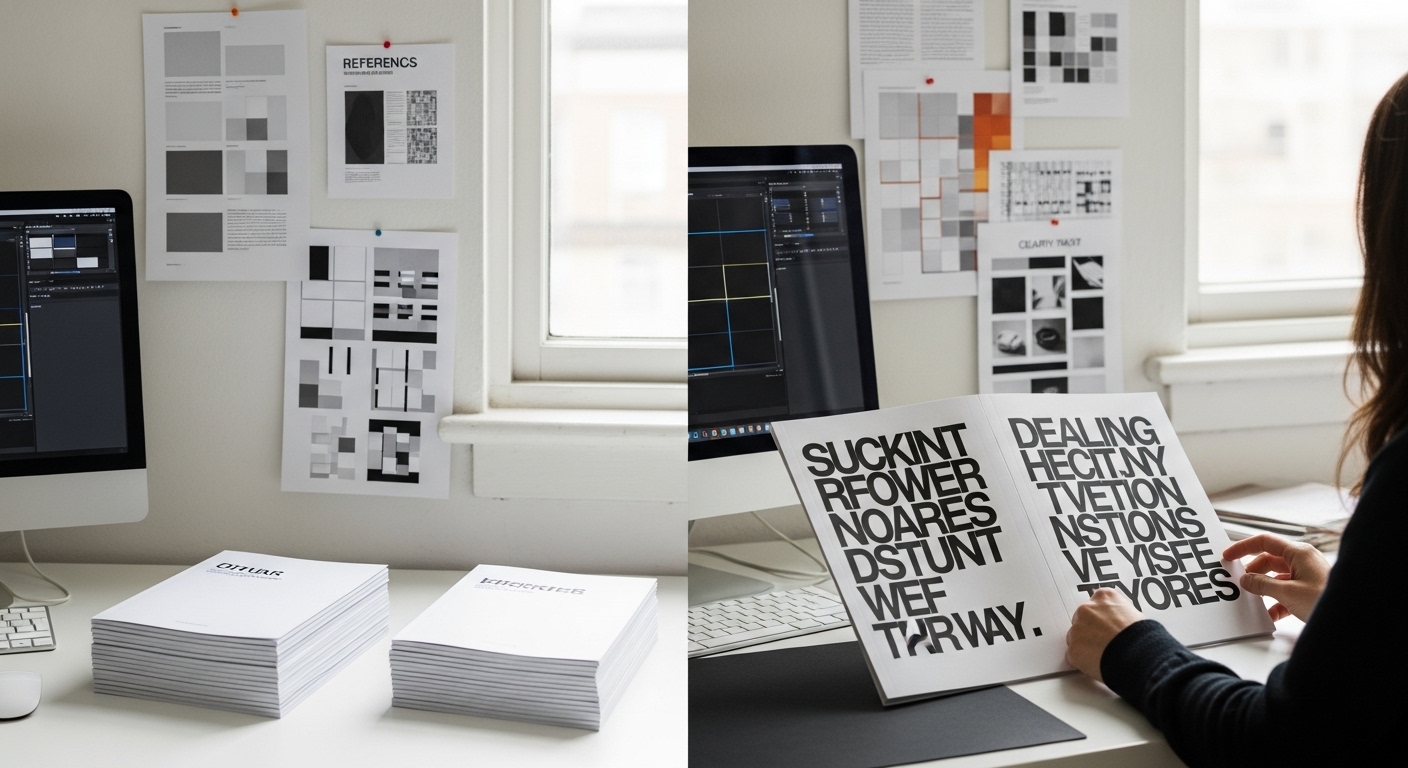
Use Visual Elements Strategically
Visual elements should complement the message rather than distract from it. Every image, icon, or graphic should have a clear role within the content.
High-quality visuals enhance credibility, while inconsistent or low-resolution images can reduce trust. Maintaining a consistent visual style throughout the booklet helps create a cohesive experience.
Placement also matters. Visuals should be integrated naturally into the layout, supporting the flow of information rather than interrupting it.
When used correctly, visuals strengthen both understanding and engagement.
Choose the Right Format and Printing Approach
The physical format of a booklet influences how it is perceived and used. Size, orientation, and binding should align with the booklet’s purpose.
A smaller booklet may feel more personal and accessible, while a larger format can create a stronger visual impact. The choice depends on how the booklet will be distributed and consumed.
Printing quality is equally important. Paper type, finish, and color accuracy all contribute to the final experience. A well-printed booklet feels more professional and leaves a stronger impression.
Investing in quality printing ensures that the effort put into content and design is not diminished.
Ensure a Lasting Impression Through Cohesion
The final step is ensuring that all elements—content, design, structure, and print—work together seamlessly. A booklet leaves an impression when it feels complete and intentional.
Consistency across pages builds trust and familiarity. The reader should feel that every element belongs where it is.
A strong closing section can also reinforce impact. Whether it’s a summary, a call to action, or a reflective ending, it should leave the reader with a clear takeaway.
When everything aligns, the booklet becomes more than just informative—it becomes memorable.
FAQs
What makes a booklet stand out from others?
A booklet stands out when it combines clear purpose, structured content, and intentional design. It should feel cohesive rather than fragmented.
How many pages should a booklet have?
There is no fixed number, but it should be long enough to deliver value without overwhelming the reader. Most effective booklets balance depth with readability.
What is the most important element in booklet creation?
Clarity of purpose is the most important element. Without it, both content and design can lose direction.
Should I prioritize design or content?
Both are important, but content should lead. Design should support and enhance the message rather than compete with it.
How can I make my booklet more engaging?
Focus on flow, readability, and visual balance. Avoid overcrowding pages and ensure that each section connects naturally to the next.
Conclusion
Creating a booklet that leaves an impression is not about adding more—it is about aligning what already exists. Clear purpose, thoughtful structure, precise writing, and intentional design all contribute to a cohesive final product.
When approached with care and clarity, a booklet becomes more than a simple format. It becomes an experience—one that informs, engages, and stays with the reader long after the last page is turned.