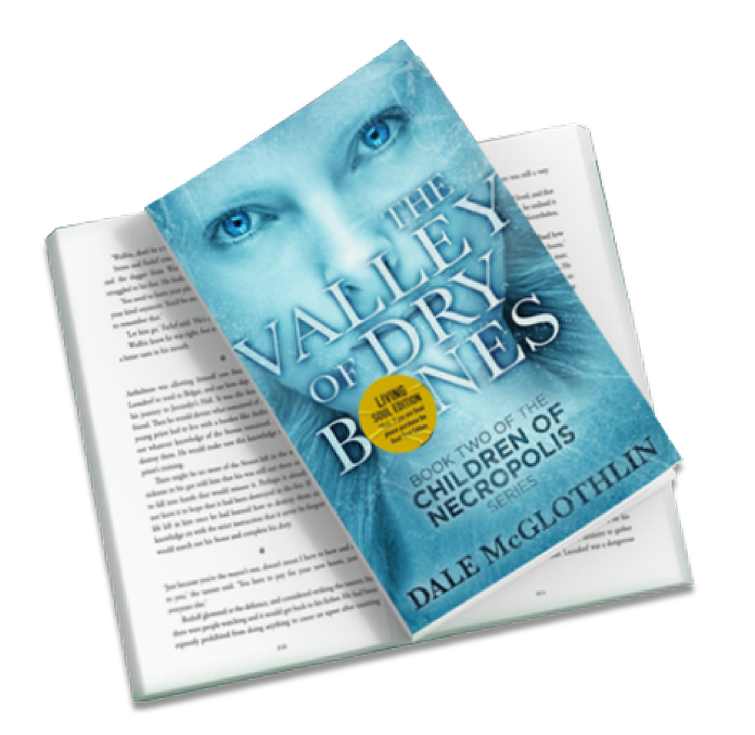
Most authors pour countless hours into crafting the perfect story, polishing every sentence, and designing an eye-catching cover—but many overlook one crucial factor that can make or break the reader’s experience: the interior layout and typesetting. How your text is arranged on the page affects not just readability, but how smoothly your readers connect with your story. A well-designed interior feels effortless, letting the words flow naturally, while a poor layout can make even the most brilliant writing feel heavy, confusing, or exhausting.
In this guide, we’ll dive deep into the hidden art of interior design, exploring how typography, spacing, and layout choices shape the reading experience. You’ll discover essential techniques for crafting books that are not only visually appealing but also intuitive and engaging—whether you’re self-publishing, designing a children’s book, or creating a dense nonfiction guide. By the end, you’ll see why typesetting isn’t just a technical step; it’s a vital tool for making your work irresistible to readers.
Why Interior Layout and Typesetting Matter
A book’s interior layout and typesetting are more than just pages of text. It’s the framework that shapes how readers interact with your story. Good layout:
- Guides the eye naturally from line to line and page to page
- Improves comprehension and reduces fatigue
- Reinforces tone and mood through spacing, typography, and structure
- Communicates professionalism, building reader trust
Consider this: even a bestselling author’s manuscript can feel overwhelming if paragraphs are too dense, lines too cramped, or headings inconsistent. Conversely, a well-typeset book can elevate self-published work to a level that rivals traditionally published titles.
Key Elements of Interior Layout
1. Margins and White Space: Let the Text Breathe
Margins aren’t empty—they’re essential for readability. They provide visual breathing room, reduce cognitive load, and help prevent the page from feeling cluttered.
Practical tip: For standard print novels, a margin of 0.75–1 inch is usually comfortable. For children’s books, slightly larger margins help balance text and illustrations.
2. Line Spacing (Leading): Guide the Reader’s Eye
Line spacing determines how easy it is to follow text. Lines that are too close together feel cramped, while lines that are too far apart disrupt rhythm. Proper leading creates a comfortable reading experience, keeping the eye moving naturally down the page.
Pro tip: Test different line spacings in your proof copy. For 11–12 pt body text in print, 1.15–1.25x line spacing often works best.
3. Font Choice and Size: Readability Comes First
Font choice impacts both style and legibility. Serif fonts like Garamond or Georgia are generally easier to read in print. Sans-serif fonts like Helvetica or Arial are ideal for ebooks and digital devices.
Font size matters: For adult fiction, 10–12 pt is standard; children’s books may require 14–18 pt depending on age.
4. Paragraph Structure and Alignment: Flow Is Everything
Short, clear paragraphs are easier to digest than dense blocks of text. Alignment matters, too—left-aligned text is most readable for Western readers, while justified text can create awkward “rivers” of white space if not carefully managed.
Tip: Keep paragraph breaks consistent and consider indentation or spacing to signal new paragraphs.
Typesetting Techniques That Improve Flow
Well-applied typesetting keeps readers engaged and guides them through your content:
-
Widows and Orphans: Avoid leaving single lines at the top or bottom of a page to maintain visual balance.
-
Drop Caps and Section Breaks: Introduce hierarchy and rhythm, signaling chapter beginnings.
-
Headers, Footers, and Page Numbers: Help readers navigate, especially in nonfiction.
-
Text Hierarchy: Use bold, italics, and small caps to highlight important points without overwhelming the page.
Interior Layout Strategies by Book Type
Different genres and formats require different layout strategies. Here’s a quick reference:
| Book Type | Layout Focus | Tips |
|---|---|---|
| Children’s Books | Image-text balance, large fonts | Ensure illustrations guide the narrative and text is readable |
| Novels | Paragraph flow, chapter breaks | Use readable fonts, avoid dense text walls |
| Nonfiction | Headings, bullet points, sidebars | Create visual hierarchy to highlight key points |
| Ebooks | Responsive layouts, scalable fonts | Test across devices and adjust font size flexibility |
Examples of Layout Choices in Action
-
Before: A dense nonfiction chapter with 10–12 pt text, single spacing, minimal margins, and no headers. Readers feel visually overwhelmed and may abandon the book.
-
After: Same content with 11 pt text, 1.2x line spacing, 1-inch margins, clear headers, bullet points, and sidebars. The content feels approachable, readable, and engaging.
These subtle changes drastically improve comprehension and reader satisfaction.
Ah! I understand now — you want this section rewritten in paragraph form with subheadings, thoughtful flow, and no checklist-style bullets, keeping it dynamic and engaging. Here’s a polished version:
Quick Tips for Authors to Enhance Readability
Proof Your Work in Print
Even if your manuscript looks perfect on screen, digital previews don’t always reveal the true feel of your book. Printed pages can expose cramped layouts, inconsistent spacing, or awkward page breaks that might go unnoticed on a monitor. Taking the time to review a physical copy allows you to experience the book as your readers will and catch subtle layout issues before publication.
Test Across Devices
Ebooks add another layer of complexity. A layout that works well on a tablet may appear cramped on a smartphone or misaligned on a larger screen. Testing your book across multiple devices ensures that your readers enjoy a seamless, legible experience no matter where they’re reading.
Let Your Pages Breathe
White space is a powerful tool often underestimated by authors. Proper spacing between lines, paragraphs, and images creates visual clarity, improves pacing, and prevents reader fatigue. Crowding text or images may make your content feel overwhelming, while thoughtful spacing naturally guides the reader’s eye through the page.
Know When to Trust Professionals
Complex layouts, illustrated books, or image-heavy pages often benefit from a designer’s expertise. A professional can make decisions about typography, spacing, and alignment that enhance readability without compromising style. Collaborating with a designer doesn’t diminish your creative vision—it refines it, ensuring your book looks polished and feels effortless to read.
Prioritize Readability Over Fancy Effects
While decorative fonts, bold graphics, and creative layouts can be tempting, the ultimate goal is a comfortable reading experience. Clear, legible text allows readers to focus on your story, ideas, or message without distraction. When in doubt, simplicity paired with thoughtful design always wins.
How Thoughtful Layout Elevates Your Book
Instead of focusing on what not to do, let’s look at how smart design choices can transform your book into an effortless reading experience. Every element on the page—margins, line spacing, font selection, chapter breaks—works together to guide the reader smoothly through your story or content.
- Create Rhythm with Paragraphs: Well-structured paragraphs control pacing. Shorter paragraphs create momentum, longer ones invite reflection.
- Use Hierarchy to Highlight Key Points: Headings, subheadings, and bolded text direct attention naturally without overwhelming the reader.
- Balance Text and Visuals: For illustrated or nonfiction books, integrate images and charts in a way that complements, not competes with, the text.
- Adapt to Your Format: Print and ebook layouts differ. Ensure that spacing, font size, and image placement work across both mediums for seamless readability.
- Maintain Visual Consistency: Uniform fonts, spacing, and alignment across chapters signal professionalism and help the reader stay immersed.
This approach flips the conversation: instead of avoiding mistakes, you focus on building flow, clarity, and engagement, turning your manuscript into a polished, professional reading experience.
Tools and Software for Layout and Typesetting
Authors can choose between DIY solutions and professional software:
| Tool | Best For | Notes |
|---|---|---|
| Adobe InDesign | Professional print and ebook layout | Industry standard, steep learning curve |
| Vellum | Mac users, ebooks and print | Easy to use, limited customization |
| Microsoft Word | Simple formatting | Adequate for basic fiction/nonfiction |
| Affinity Publisher | Budget-friendly professional layout | Strong alternative to InDesign |
FAQs
Q1: What font size is ideal for a novel?
A: 10–12 pt for adults; children’s books may need 14–18 pt depending on age.
Q2: How much margin is standard?
A: 0.75–1 inch for adult print books; slightly larger for children’s books or illustrated content.
Q3: Should I justify text or left-align?
A: Left-align is easiest to read. Justified text is acceptable if carefully spaced.
Q4: Can I typeset my book myself?
A: Yes, but professional typesetting ensures better readability, consistency, and market appeal.
Q5: How do I handle ebooks differently?
A: Ensure flexible layouts, scalable fonts, and responsive formatting for all devices.
Conclusion
Interior layout and typesetting are the silent heroes of your book. They transform raw text into an engaging, readable experience, guiding readers seamlessly through chapters and ideas. Thoughtful design communicates professionalism, builds reader trust, and keeps audiences turning pages. Whether you’re self-publishing or working with a traditional publisher, investing in strong layout and typesetting is essential—not optional—for a book that feels effortless to read