A book cover is often the first thing a reader notices—and sometimes the only thing that determines whether they pick up your book or scroll past it. While many authors focus intensely on the content of their writing, the cover plays a crucial role in shaping first impressions, signaling genre, and building a professional identity. Redesigning your book cover can be an exciting opportunity to attract new readers, refresh your branding, or align with current market trends. However, it’s not a decision to take lightly. A poorly planned redesign can confuse loyal readers, dilute your brand, or fail to capture the attention of your target audience.
Before making changes, it’s essential to consider several factors, from market expectations and reader perception to the psychology of design and practical logistics. In this article, we’ll explore the key considerations that should guide any author contemplating a book cover redesign. By approaching the process thoughtfully, you can ensure your new cover makes a positive impact while staying true to your story and brand.
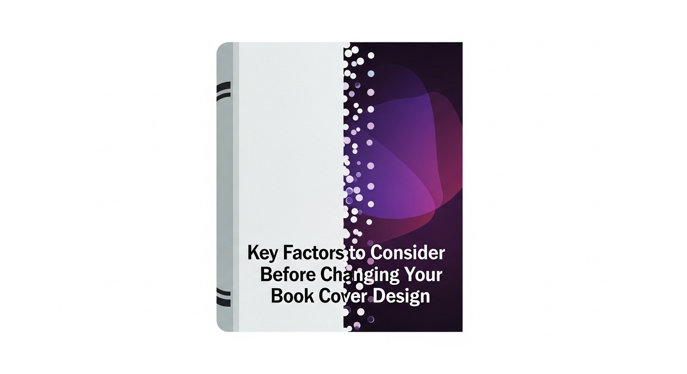
Why Book Covers Matter More Than Ever
The visual appeal of a book cannot be underestimated. With thousands of titles competing for attention both online and in stores, a cover often serves as the gateway to your content. It communicates tone, genre, and professionalism. Readers often make split-second decisions based on visual cues alone.
Beyond aesthetic appeal, book covers function as a marketing tool. They influence discoverability in search results, social media engagement, and even word-of-mouth promotion. When a cover resonates with a reader, it can spark curiosity, build trust in your brand, and encourage sharing.
Therefore, a cover redesign is not simply a cosmetic change—it is a strategic move that can redefine how your book is perceived and how effectively it reaches new readers.
Assessing the Need for a Redesign
Before committing to a redesign, consider why your current cover might be underperforming. Some common reasons include:
- Sales plateauing or declining despite consistent marketing efforts.
- Mismatched design elements, where imagery, typography, or color fail to convey the book’s genre or theme.
- Outdated visuals that no longer align with current market trends.
- Series inconsistency, where one title stands out awkwardly compared to others in a collection.
Taking a step back to analyze these factors helps ensure the redesign addresses the root issues rather than simply providing a superficial change.
Understanding Market Trends and Reader Expectations
Genre Conventions
Every genre has visual cues that readers unconsciously recognize. Romance novels may feature soft colors, evocative imagery, or intimate silhouettes. Mystery and thriller covers often utilize dark tones, bold typography, and striking contrasts. Nonfiction books may favor clean layouts, professional photography, or authoritative fonts.
Ignoring these conventions can lead to confusion. Readers may pass over a book that doesn’t “look right” for its category, even if the content is exceptional. Observing trends and understanding the visual language of your genre is essential for designing a cover that aligns with reader expectations.
Balancing Trend and Timelessness
While it’s important to stay current, being overly trendy can shorten the shelf life of a cover. Covers should feel modern and relevant without appearing gimmicky. A timeless approach often incorporates classic design principles, balanced typography, and imagery that speaks to the story rather than following fleeting trends.
Considering Your Target Audience
Insights from Your Readers
Your audience is your most valuable guide. Consider collecting feedback through surveys, email newsletters, or social media polls. Ask readers what appeals to them visually and how they perceive your current cover. This feedback can provide clarity on whether a redesign is necessary and what elements should be emphasized.
Emotional Connection
Covers convey emotion before words do. A thoughtful redesign can better capture the essence of your book’s story or message. For example, a novel about personal growth might benefit from uplifting imagery and soft color schemes, while a thriller might need stark contrasts and suspenseful elements.
Maintaining Series Cohesion
If your book is part of a series, consistency is critical. A sudden shift in style can confuse readers or disrupt brand identity. When updating a single title’s cover, consider aligning it with the visual style of the other books in the series for a harmonious look.
Branding Implications of a Cover Redesign
A book cover is an extension of your author brand. Updating the cover can reinforce or redefine your identity as a writer.
- Visual Identity: Colors, fonts, and design elements should harmonize with your other works and marketing materials.
- Author Recognition: Established authors rely on a recognizable style. Drastic changes risk temporarily affecting discoverability.
- Marketing Consistency: Consider how the cover will look across social media banners, online retailers, and promotional graphics. Cohesion strengthens professional credibility.
Cost and Logistical Considerations
Design Expenses
Professional designers vary in cost based on experience, complexity, and licensing for fonts or images. Budgeting for high-quality work is essential, as a poor design may require multiple revisions and still fail to attract readers.
Format Adaptation
Books exist in multiple formats—print, eBook, audiobook—and each format may require adjustments to ensure clarity and impact. Designers should provide versions optimized for each format.
ISBN and Metadata
Significant design changes might necessitate updates to your book’s metadata or, in rare cases, a new ISBN. Understanding these technical requirements ahead of time prevents delays in publishing and distribution.
Design Psychology: Color, Typography, and Imagery
Color Choices
Colors evoke emotions and convey meaning. For instance, red can indicate urgency or passion, blue suggests calm or intelligence, and yellow often conveys optimism or energy. Choosing a color palette aligned with your story enhances reader engagement.
Typography
Font choice affects readability and perception. Serif fonts often convey tradition or authority, while sans-serif can appear modern and clean. Display fonts add emphasis but should be used sparingly.
Imagery and Symbolism
Images and symbols must align with the narrative and tone of your book. Overly busy or irrelevant graphics can distract readers, while thoughtful imagery reinforces the story’s themes and engages the audience emotionally.
Digital vs. Print Considerations
Covers must perform across all platforms. A design that looks striking on a printed book might lose clarity as a thumbnail online.
- Thumbnail Visibility: Ensure the title and key imagery remain legible at smaller sizes.
- Print Quality: High-resolution files, correct color profiles, and proper bleed are essential for physical copies.
- Format Consistency: The cover should convey the same story visually across both print and digital editions.
Timing and Strategy for a Cover Redesign
Strategic Launch
Timing a redesign can enhance its impact. Consider launching alongside a new series entry, special edition, or marketing campaign to maximize visibility.
Seasonal Trends
Some genres experience seasonal peaks. A well-timed redesign can capitalize on these trends, boosting discoverability when readers are most engaged.
Marketing Synergy
Pairing a cover change with coordinated promotions, email campaigns, or social media announcements ensures the redesign reaches both existing fans and potential readers.
Comparison Table: Old Cover vs. Redesigned Cover
| Factor | Old Cover | Redesigned Cover |
| Reader Appeal | Limited engagement | Optimized for emotional and visual impact |
| Market Relevance | Outdated elements | Aligned with current genre expectations |
| Brand Alignment | Inconsistent with author portfolio | Cohesive with other works |
| Visual Psychology | Minimal emotional cues | Deliberate use of color, typography, imagery |
| Cross-Format Performance | May not translate well online | Clear in both print and digital |
Common Questions About Redesigning Your Book Cover
Q1: How do I know if my book cover truly needs a redesign?
If sales are stagnating, reader feedback indicates confusion, or the cover feels outdated, a redesign may help revitalize interest and align your book with current market expectations.
Q2: Can redesigning a cover harm my book’s existing audience?
If the cover is drastically different from a series’ visual identity, it may cause temporary confusion. Maintaining elements of consistency mitigates this risk.
Q3: How do I test new cover concepts before committing?
A/B testing on social media, polls, or feedback from beta readers provides valuable insights into which design resonates best with your audience.
Q4: Should I prioritize trends or timeless design?
A balance is key. Trend-informed designs can attract attention, but timeless elements ensure longevity and broad appeal.
Q5: Can a new cover increase sales significantly?
Yes. A well-executed redesign can attract new readers, re-engage past readers, and improve visibility in competitive markets.
Conclusion
Redesigning a book cover is a strategic decision that combines creativity, marketing insight, and reader psychology. By carefully evaluating your audience, market trends, brand identity, and design choices, you can create a cover that not only captures attention but also strengthens your author brand. A thoughtfully redesigned cover breathes new life into a book, ensuring it stands out in a crowded marketplace and continues to resonate with readers for years to come.
Investing in your cover is an investment in your story’s reach, discoverability, and long-term success. With careful planning, attention to detail, and a deep understanding of your readers, a redesigned cover can transform how your book is perceived and experienced.