Selecting the right paper stock is one of those decisions that often gets treated as a technical afterthought, but in practice, it quietly defines the entire reading experience. Long before a reader absorbs your content, they are already forming an impression through weight, texture, and finish. That impression influences whether your book feels premium, practical, disposable, or collectible.
For creators working in publishing today—especially in niches like coloring books, photography books, journals, or educational material—paper choice is not just a production detail. It is part of the product design itself. The same manuscript or artwork can feel completely different depending on the paper it is printed on.
This is why understanding paper stock is essential if you are aiming to create books that not only look good on a screen but also feel right in the hands of a reader.
Why Paper Stock Matters More Than Most Creators Realize
In writing and designing physical books, paper stock is often overlooked because it works quietly in the background. Unlike cover design or illustrations, it does not actively compete for attention. Yet it is always present, shaping how every page is experienced from the moment the book is opened.
The first physical interaction a reader has is not the content itself—it is the feel of the pages. The resistance when turning them, the smooth or textured surface, and the way light reflects off the paper all contribute to an immediate impression of quality. These subtle sensory cues influence perception instantly. A thick, well-finished page signals care, intention, and professionalism, while thin or inconsistent paper can reduce the perceived value of even the strongest written or designed content.
There is also a strong psychological element at play. Readers naturally associate heavier, higher-quality paper with authority, durability, and trustworthiness. This becomes especially important in books intended for repeated use, such as workbooks, journals, educational materials, or reference guides, where the book writing must support long-term engagement.
In interactive formats like coloring books or sketchbooks, paper choice becomes even more critical. If the stock cannot handle repeated pressure from pencils, pens, or markers, the usability of the entire product is compromised. In this context, paper is no longer just a background material—it becomes part of the functional design of the book itself, directly shaping how the content performs in real use.
Understanding Paper Weight (GSM) and What It Actually Means
GSM, or grams per square meter, is the standard measurement used to define paper thickness and density. While it may appear purely technical, it directly influences how your book feels, performs, and even how it is priced.
Lower GSM papers, typically used in mass-market novels, are designed for efficiency. They are thin, flexible, and lightweight, which makes books easier to ship and more affordable to produce. However, this lightness comes at a cost: reduced opacity and a higher chance of text or images showing through from the other side.
As GSM increases, paper becomes thicker, more durable, and more resistant to ink bleed. This is why higher GSM paper is commonly used in visual-heavy books or interactive formats. It provides a more substantial feel and improves the overall tactile experience.
However, higher GSM also increases book thickness and production cost. A 150 GSM book will physically feel much more premium than a 90 GSM one, but it will also be heavier and more expensive to print and ship.
This is where creators need to think strategically. The “best” GSM is not universal—it depends entirely on how the book will be used, how often it will be handled, and what kind of experience you want to deliver to your audience.
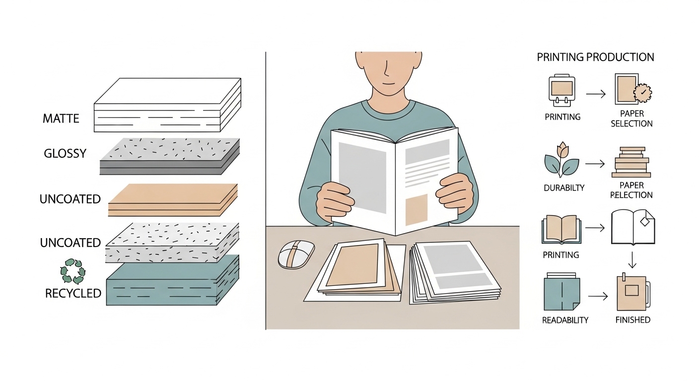
Paper Finish: Matte, Glossy, and Uncoated Options
Paper finish determines how the surface of the page interacts with light, ink, and touch. It plays a major role in both visual appeal and usability, especially in books that rely heavily on design or imagery.
Matte paper is often considered the most versatile option. It reduces glare, which makes reading and coloring more comfortable under different lighting conditions. It also provides a soft, natural look that works well for both text and illustrations. Because of its non-reflective surface, it tends to feel more modern and user-friendly, especially for long reading or coloring sessions.
Glossy paper, on the other hand, is designed to enhance visual intensity. Colors appear richer, contrasts become sharper, and images feel more vibrant. This makes it ideal for photography books, catalogs, or any publication where visual impact is the primary goal. However, its reflective surface can create glare, which makes it less comfortable for extended reading or hands-on use like coloring.
Uncoated paper sits in a different category altogether. It has a raw, textured feel that gives it a more traditional or artisanal quality. This type of paper absorbs ink more readily, which can soften printed lines and reduce sharpness, but it offers a very tactile, natural reading experience. It is often used in sketchbooks, journals, or books that aim to feel personal and handcrafted.
Choosing between these finishes is not just about aesthetics—it is about aligning the physical experience of the book with its intended purpose.
How Paper Stock Impacts Different Types of Books
Different book formats require different material priorities, and paper stock must adapt accordingly.
For text-heavy books like novels or nonfiction, readability and cost efficiency are the main considerations. Lightweight paper works well because it reduces bulk and allows for longer reading sessions without fatigue. Since these books rely primarily on words rather than visuals, ultra-thick paper is unnecessary and can even make the book less practical.
In coloring books, the requirements shift completely. Here, durability and opacity become critical. Readers are actively interacting with the pages, applying pressure with pencils, pens, or markers. If the paper is too thin, ink will bleed through or damage adjacent pages, ruining the experience. Heavier matte paper is typically preferred because it can handle repeated use while maintaining clarity.
Photography books sit at the opposite end of the spectrum. They rely heavily on visual fidelity. Glossy or semi-gloss papers are often used because they enhance color depth and image sharpness. In these books, the paper becomes part of the visual presentation itself, directly influencing how the artwork or photography is perceived.
Workbooks and educational materials fall somewhere in between. They require a balance of writability and durability. The paper must be thick enough to handle repeated writing or erasing, but not so heavy that it makes the book unnecessarily expensive or bulky.
Each category demonstrates a simple truth: paper is not neutral. It actively shapes how the content is used.
Cost vs Quality: Finding the Right Balance in Paper Stock Selection
One of the most strategic decisions in publishing is finding the balance between production cost and perceived product quality. Paper stock sits directly at the center of this decision because it influences both your manufacturing budget and how customers judge your book the moment they hold it.
Higher-quality paper naturally increases production expenses. Heavier GSM, premium coatings, and specialty finishes all raise printing costs, which then affects your pricing strategy and profit margins. For independent creators or small publishers, this can quickly become a major constraint if not planned carefully.
However, the opposite approach—choosing the cheapest available paper—can quietly damage your product’s market performance. Readers often associate physical quality with content value. Even if your writing, illustrations, or design work is strong, a book that feels thin, flimsy, or poorly printed can create an immediate sense of low value.
This is particularly important in competitive marketplaces like Amazon KDP or Etsy, where buyers are not just comparing ideas—they are comparing physical impressions through previews, reviews, and product images. In such environments, paper quality becomes a silent but powerful decision-making factor.
The real objective is not to maximize quality at any cost, but to strategically align paper selection with the expectations of your target audience and the purpose of the book.
How Cost and Quality Interact in Publishing Decisions
Cost and quality are not separate variables—they are tightly connected. Every upgrade in paper stock quality usually increases:
- Material cost per unit
- Printing and production fees
- Shipping weight (especially for print-on-demand models)
- Final retail price pressure
At the same time, improving paper quality can increase:
- Perceived value of the book
- Customer satisfaction and reviews
- Return on pricing flexibility
- Brand credibility and repeat purchases
This creates a balancing equation where the “best” option depends on your niche positioning, not just your budget.
When to Invest in Premium Paper Stock
Premium paper is not always necessary, but in certain cases it significantly improves product performance. It is most justified when the user experience depends heavily on physical interaction or visual quality.
Examples include:
- Coloring books where ink resistance and durability matter
- Art books and illustration-heavy publications
- Photography books requiring color accuracy and depth
- Journals or specialty notebooks designed for repeated use
In these cases, users expect a tactile experience that feels substantial and long-lasting. Cutting corners on paper quality here can directly impact reviews and perceived professionalism.
When Standard Paper Stock Is Sufficient
Not every book benefits from premium materials. In fact, over-investing in paper quality for the wrong type of book can reduce profitability without adding meaningful value.
Standard paper stock is typically sufficient for:
- Text-heavy novels
- Basic informational guides
- Low-interaction digital reading formats
- Budget-friendly educational material
In these cases, readers prioritize content over physical durability. A well-written book on standard paper often performs just as well as a premium version because the experience is driven by reading rather than physical interaction.
Cost vs Quality Comparison Table
| Paper Choice Level | Typical GSM Range | Cost Impact | User Experience Impact | Best Use Case |
| Budget Paper | 70–90 GSM | Low production cost | Basic feel, lower durability | Novels, mass-market text books |
| Standard Paper | 100–120 GSM | Balanced cost | Comfortable reading experience | General publishing, guides |
| Premium Paper | 120–150 GSM | Higher cost | Strong tactile quality, durable | Coloring books, journals |
| High-End Art Paper | 150+ GSM | Highest cost | Luxury feel, excellent visual output | Photography books, collector editions |
This breakdown shows that paper selection is not about choosing “good vs bad,” but about matching material quality to functional purpose.
Aligning Paper Choice With Customer Expectations
The most important principle in cost-quality balance is alignment with buyer expectations. Readers do not evaluate paper in isolation—they evaluate whether the physical experience matches the promise of the product.
For example, a premium-priced coloring book printed on thin paper will feel disappointing, even if the artwork is excellent. On the other hand, a simple educational workbook printed on overly expensive paper may feel unnecessary and overpriced.
This mismatch is where many creators lose value without realizing it. The goal is consistency between:
- Product category
- Price point
- Audience expectations
- Physical quality level
When these elements are aligned, the book feels “right” to the buyer, even if they cannot explicitly explain why.
Strategic Thinking: Treat Paper as Part of Your Brand
In modern publishing, paper stock is not just a production choice—it is part of your brand identity. Consistency in material quality across multiple books builds recognition and trust.
If your coloring books consistently use thick, durable paper, customers begin to associate your brand with premium usability. If your novels use lightweight, comfortable paper, readers associate your brand with accessibility and readability.
Over time, this consistency becomes a competitive advantage that goes beyond individual titles.
Print Compatibility and Technical Considerations
Beyond aesthetics and cost, paper stock must also be compatible with the printing method you are using. Print-on-demand services, commercial printers, and offset printing systems all have different limitations and recommended paper ranges.
Ink absorption is one of the most important technical factors. If paper absorbs ink too quickly, colors may appear dull or blurred. If it resists ink too much, smudging and drying issues can occur. Proper balance ensures clarity and consistency across all pages.
Opacity is another critical factor. If paper is too transparent, content from one side of the page may show through to the other, which is especially problematic in image-heavy or text-dense books.
Binding also plays a role. Thicker paper increases the spine width of the book, which can affect how covers are designed and how the book sits when closed. These small technical details can have a noticeable impact on the final product.
User Experience: The Hidden Factor Behind Paper Choice
While technical specifications are important, the real test of paper stock happens in the hands of the reader. User experience is where all decisions come together.
A reader may never consciously think about GSM or coating type, but they will absolutely notice if pages feel flimsy, if ink bleeds through, or if the book feels uncomfortable to use. These impressions directly influence reviews, recommendations, and repeat purchases.
In many cases, the paper determines whether a book feels like a disposable item or something worth keeping. That emotional distinction is powerful, especially in niches like art books, journals, or creative workbooks where personal engagement is high.
Sustainability and Modern Paper Choices
In recent years, sustainability has become an increasingly important factor in publishing decisions. Many creators and publishers are now considering environmentally responsible paper sources as part of their production strategy.
Recycled paper, FSC-certified materials, and eco-friendly inks are becoming more common in both independent and commercial publishing. These choices not only reduce environmental impact but also influence how readers perceive the brand behind the book.
For many modern buyers, sustainability is no longer a bonus—it is part of the expected product identity. Incorporating responsible paper choices can therefore add both ethical and marketing value.
Final Thoughts
Choosing the right paper stock is not a secondary production detail—it is a foundational decision that affects every layer of a book’s success. From tactile experience to visual presentation, from durability to cost structure, paper defines how your content exists in the physical world.
When aligned correctly with purpose and audience, paper enhances the content rather than just supporting it. It turns a simple printed product into a cohesive, intentional experience that readers can feel as much as they read.
In publishing, design may attract attention, but paper is what determines how long that attention lasts.