An event booklet is often treated as a background element—something printed out of necessity rather than intention. At first glance, it seems simple enough: a few schedules, speaker profiles, maybe a sponsor page or two. But that simplicity is deceptive. In practice, the booklet is one of the first structured experiences an attendee interacts with, and it quietly begins shaping how the entire event will be perceived.
Long before any session begins, people are already reading it. They are not just looking for timings or names—they are subconsciously assessing order, clarity, and professionalism. How information is arranged, how easily it can be understood, and how smoothly it guides attention all contribute to an early judgment about the event itself.
This is where the real difference emerges. A poorly designed booklet introduces friction: information feels scattered, navigation feels unclear, and the event starts to feel less organized than it actually is. A well-designed booklet does the opposite. It creates immediate confidence, reduces uncertainty, and gives the audience a sense that everything has been thoughtfully planned.
What often goes unnoticed is that this impression is formed silently, within seconds, before a single speaker takes the stage. That is why the event booklet is not just a support document—it is part of the experience architecture itself.
Understanding What an Event Booklet Actually Does
At its core, an event booklet is not just informational. It is interpretive. It translates a complex event into something visually and mentally manageable for the audience.
It shapes how attendees perceive the event
Even before the event begins, the booklet sets expectations. Clean structure and clear layout signal professionalism. Cluttered pages or inconsistent formatting signal disorganization, even if the event itself is well planned.
This perception is powerful because it happens instantly and often unconsciously. The booklet becomes a silent communicator of quality.
It guides attention throughout the event
A well-designed booklet works like a navigation tool. It helps attendees understand what is happening, when it is happening, and where they should focus their attention. Without that clarity, even a well-organized event can feel overwhelming.
In many ways, the booklet reduces cognitive load. Instead of trying to remember everything, attendees rely on structure.
Why Most Event Booklets Fail Before the Event Even Starts
Many event booklets fail not because of poor design tools, but because of poor thinking.
One of the most common issues is overloading information. Organizers often try to include every detail they can think of—every schedule, every sponsor, every description. The result is a dense document where nothing stands out.
When everything is emphasized, nothing is emphasized.
Another issue is a lack of visual hierarchy. If all text looks the same in size and weight, the reader has no natural path through the content. They are forced to search for meaning instead of being guided toward it.
There is also an inconsistency. When typography, spacing, and layout change unpredictably across pages, the booklet stops feeling like a single system and starts feeling like a collection of unrelated parts.
These problems are not visual—they are structural.
Building Clarity Before Any Design Begins
A strong event booklet is never built inside design software first. It is built in structure and intent before a single page is created.
Defining the real purpose of the booklet
Every booklet needs a clear job. It is not enough to say “it provides information.” The purpose must be specific. It might be guiding attendees through sessions, reinforcing branding, or simplifying navigation during a multi-day event.
When the purpose is unclear, the booklet becomes a dumping ground for content. When it is clear, every page has direction.
Understanding who will actually use it
Design decisions only make sense when they are tied to audience behavior. A corporate audience will expect clarity and structure. A creative audience may respond better to expressive layouts.
The booklet is not designed for organizers—it is designed for readers who are trying to make sense of an experience in real time.
Organizing content before layout begins
One of the most overlooked steps is content structuring. Before designing anything, the information needs to be arranged logically: introduction, schedule, sessions, speakers, and supporting details.
When content is structured first, design becomes a tool for clarity instead of correction.
Moving From Planning Into Design With Intention
Once the foundation is clear, design becomes the next layer of translation. This is where structure becomes visual.
But this transition is often where mistakes begin. Many designers jump straight into aesthetics—colors, fonts, layouts—without establishing consistency rules.
A better approach is to define a visual system first. This includes typography behavior, spacing logic, and layout rules that apply across all pages.
Without this system, each page becomes a separate design decision. With it, the booklet becomes a unified experience.
Structuring the Booklet So It Feels Effortless to Navigate
A well-designed event booklet should never feel like something the reader has to “figure out.” The ideal experience is almost invisible—information is simply found when needed, understood immediately, and then effortlessly left behind until required again. That ease of interaction is not accidental; it is the result of deliberate structural design.
Structure is what transforms a collection of pages into a guided experience. It determines how quickly a reader finds meaning, how comfortably they move between sections, and how clearly they understand the overall event flow. When structure is weak, even good content feels scattered. When structure is strong, even complex information feels simple.
Creating a natural reading progression
The most effective event booklets follow a flow that mirrors how people naturally experience events in real life. Attendees do not process information randomly—they move from anticipation, to orientation, to participation. A booklet should reflect that same psychological journey.
This is why the opening sections typically begin with context. The reader first needs to understand what the event is, why it exists, and how it is structured at a high level. This creates orientation. Without it, every following page feels disconnected.
Once context is established, the booklet should transition into core functional information such as schedules or agendas. This is the most actively used section during the event itself, so clarity here is essential. The reader should be able to quickly locate timing, sessions, and locations without scanning through unnecessary detail.
After that, the structure naturally expands into supporting layers such as speaker profiles, sponsor information, or session descriptions. These sections add depth, but they should never interrupt the core navigational flow. Instead, they act as context enhancers that support understanding rather than dominate attention.
When this progression is thoughtfully arranged, the reader never feels disoriented. They are not jumping between unrelated sections—they are moving through a controlled sequence that feels logical and predictable.
Balancing dense and light sections for better readability
One of the most overlooked aspects of booklet structure is pacing. Many booklets fail not because the information is incorrect, but because every page feels equally heavy. This creates visual fatigue and reduces engagement over time.
A strong booklet deliberately alternates between information-heavy sections and visually lighter sections. Dense pages are necessary for schedules, detailed descriptions, or structured data. However, these should be balanced with pages that offer visual relief, such as speaker highlights, section dividers, or image-led layouts.
This variation creates rhythm. The reader experiences natural pauses without losing context, which makes the booklet easier to process over extended use.
Without this balance, the booklet becomes exhausting. Even if the content is valuable, the lack of visual breathing space makes it harder to sustain attention. Over time, readers begin to skip sections or rely less on the booklet altogether.
When density is intentionally controlled, the booklet becomes more usable, more engaging, and significantly more effective as a communication tool.
Writing That Communicates Without Effort
The writing inside an event booklet has one job: clarity.
It is not a space for storytelling complexity or decorative language. It is a space for direct communication. Sentences should be structured in a way that allows quick understanding. Attendees should not need to reread information to grasp meaning. Equally important is avoiding unnecessary repetition. If information is already clear in one section, it should not be repeated elsewhere unless it serves a structural purpose. Good booklet writing is a great experience. The reader notices the information, not the effort behind it.
Designing Visual Hierarchy That Controls Attention
Visual hierarchy is what turns information into navigation. When hierarchy is strong, the reader instinctively knows where to look first, what is important, and what is secondary. Typography plays a central role here. Differences in size, weight, and spacing guide attention without needing explanation. Spacing is equally important. It separates ideas and allows the reader to mentally organize information without effort. Without hierarchy, every element competes for attention. With it, everything has its place.
Using Visual Elements With Purpose, Not Decoration
Images and graphics should never exist just to fill space. In an event booklet, every visual element must support understanding. Some visuals introduce speakers, some reinforce themes, and others break up dense sections. But all of them must have a reason for being there. When visuals are consistent in style and purpose, they strengthen the booklet’s identity. When they are random, they weaken it. The difference between a professional booklet and an amateur one is often not complexity—it is intention.
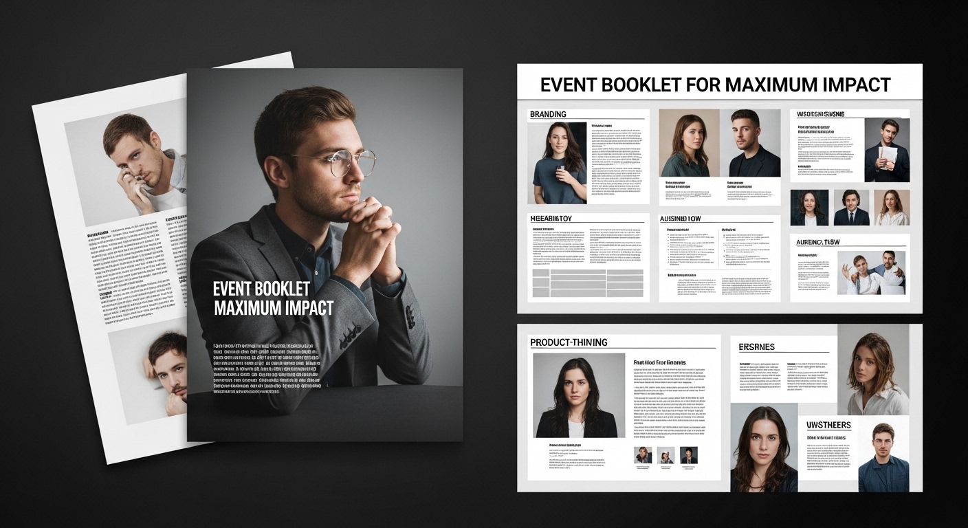
Choosing the Right Format and Print Experience
The physical version of an event booklet has a direct impact on how it is perceived. Size, paper quality, and binding all influence how the booklet feels in hand. A well-printed booklet immediately communicates care and professionalism. Different formats serve different experiences. A compact booklet feels functional and easy to handle, while a larger format feels more formal and detailed. Printing decisions are not technical afterthoughts—they are part of the experience design.
How a Strong Event Booklet Enhances the Event Itself
A well-designed booklet does more than organize information. It elevates the event experience as a whole.
When attendees feel oriented, they engage more confidently. When they understand structure, they participate more effectively. When they trust the presentation, they focus more on content rather than confusion. In this way, the booklet becomes an invisible support system for the entire event.
Choosing the Right Format and Print Experience
The physical format of an event booklet is not a minor production detail—it is one of the most influential factors in how the booklet is experienced and interpreted. Before a single page is read, the reader is already forming judgments based on how the booklet feels in the hand, how it opens, how it flips, and even how it reflects light.
In other words, format and print quality quietly shape credibility. A well-designed booklet printed poorly loses impact. A simple design printed well can feel premium and intentional. This is why format selection should be treated as part of the design process itself, not a final step.
To make the right choices, it is important to understand how each physical decision affects usability, perception, and overall event experience.
Understanding format as part of experience design
When selecting a booklet format, the goal is not only to fit content—it is to shape interaction. The format determines how attendees hold, navigate, and engage with information during the event.
A small, compact booklet creates a sense of convenience. It is easy to carry, quick to reference, and feels practical in fast-paced environments such as conferences or multi-session events. However, it naturally limits space, which forces tighter design and more disciplined content structuring.
A larger format, on the other hand, allows more breathing room for visuals and detailed layouts. It creates a stronger visual presence and often feels more formal or premium. The trade-off is portability and ease of handling, especially during live events.
This is why format selection should always begin with a question of experience intent, not just aesthetics or cost.
How size influences perception and usability
Booklet size directly affects how the content is consumed. It changes reading distance, attention span, and even emotional tone.
Smaller formats tend to feel more personal and functional. They encourage quick scanning and repeated use throughout an event. They are often preferred when information needs to be accessed frequently, such as schedules or session guides.
Larger formats feel more immersive. They allow stronger visual hierarchy, bigger typography, and more expressive layouts. This makes them suitable for branding-heavy events, exhibitions, or ceremonial programs where presentation matters as much as information.
The key is consistency between size and purpose. A mismatch—such as a highly detailed corporate schedule in an oversized decorative format—can create unnecessary friction for the reader.
The role of paper quality in perceived value
Paper is one of the most underestimated elements in booklet design, yet it has a direct psychological effect on perception.
Heavier paper stock immediately communicates quality and permanence. It feels stable, professional, and intentional. Lighter paper may reduce production cost, but it can also make the booklet feel temporary or less important.
Finish also plays a significant role. Matte finishes tend to feel more refined and modern, reducing glare and improving readability under different lighting conditions. Glossy finishes enhance color intensity, making them more suitable for image-heavy designs, but they can sometimes reduce readability in bright environments.
Choosing paper is not just about aesthetics—it is about how long you want the booklet to feel relevant after the event ends.
Binding methods and their impact on usability
Binding determines how the booklet physically behaves when used. It affects how easily pages turn, how the booklet lays on surfaces, and how durable it feels over time.
Saddle stitching is commonly used for shorter booklets. It is lightweight, cost-effective, and allows the booklet to open fairly flat. However, it is not suitable for high page counts.
Perfect binding creates a more professional and book-like appearance. It is ideal for longer or more formal event booklets, though it may not open completely flat, which can affect usability during live events.
Spiral binding prioritizes functionality. It allows full page rotation and easy handling, making it practical for schedules or reference-heavy content, but it can feel less formal in presentation.
Each binding type communicates something subtly different about the event itself, which is why this choice should align with tone and purpose.
How print quality defines the final impression
Even the most carefully designed booklet can lose impact if print quality is inconsistent. Color accuracy, alignment, and sharpness all contribute to how professional the final product feels.
Poor color reproduction can distort branding and reduce visual clarity. Misaligned printing can disrupt layout hierarchy, making even well-structured content feel careless. Low-resolution output can weaken images and reduce overall visual impact.
High-quality printing, on the other hand, reinforces every design decision made earlier. It ensures that typography is crisp, colors are consistent, and layouts appear exactly as intended.
In many cases, print quality is what ultimately determines whether a booklet feels standard or premium.
Aligning format decisions with event purpose
The most effective event booklets are those where format choices clearly reflect the nature of the event itself.
A corporate summit typically benefits from structured, clean formats with strong readability and minimal distraction. A creative festival may lean toward larger formats with expressive visuals and more experimental layouts. A product launch often requires a balance between branding impact and functional clarity.
When format, paper, binding, and print quality all align with event purpose, the booklet stops feeling like a separate object and becomes part of the event experience itself.
Why format decisions should never be treated as final steps
A common mistake is treating print decisions as something to finalize after design is complete. In reality, format constraints should influence design from the beginning.
Page size affects layout structure. Binding affects margin planning. Paper type affects color usage. Ignoring these factors early often leads to redesigns or compromises later.
When format is integrated into the design process from the start, the final booklet feels more cohesive, intentional, and professionally executed
FAQs
What is the main purpose of an event booklet?
It helps attendees understand event structure, navigate sessions easily, and experience the event in an organized way.
What makes an event booklet effective?
Clarity, consistent structure, strong visual hierarchy, and purposeful content.
How long should an event booklet be?
It should be long enough to cover essential information but concise enough to remain easy to navigate.
Is design more important than content?
Neither works alone. Content provides meaning, while design ensures clarity and usability.
What is the most important design principle?
Clarity of structure and hierarchy is the foundation of an effective event booklet.
Conclusion
Designing an event booklet for maximum impact is not about adding more information or creating visually complex pages. It is about building clarity into every layer of communication.
When structure, writing, and design align, the booklet stops being a document and becomes an experience tool. It guides attention, reduces confusion, and strengthens the overall perception of the event. A strong event booklet does not demand attention—it earns it quietly through clarity and intention.