Most brands don’t lose customers because their products are bad.
They lose them because the way those products are presented fails to hold attention.
Think about how people actually browse today. You land on a cluttered website or flip through a poorly structured catalog. There are too many options, no clear starting point, and nothing guiding your decision. The visuals feel inconsistent, the information feels scattered, and within seconds, you’re gone.
That is the real cost of a weak product catalog—it doesn’t create friction you can see, but it quietly breaks the decision process. You land on a catalog where everything feels deliberate. Categories make sense immediately. Products are easy to scan. Images are sharp, consistent, and informative. Descriptions answer your questions before you even ask them. Instead of feeling overwhelmed, you feel guided.
You stay longer. You explore more. You move closer to buying.
That shift is not accidental. It is the result of structured catalog design—where layout, hierarchy, content, and clarity are all working together to support decision-making. A well-built product catalog does more than display items. It shapes how customers think, what they notice, and how confidently they move toward a purchase. It acts as a conversion engine, a brand storyteller, and a trust signal at the same time.
And in competitive markets, that difference is not minor—it is what separates catalogs that get ignored from those that drive consistent growth.
Let’s break down how—and why—it directly impacts your results.
The Product Catalog Is Your Most Underrated Sales Tool
Most businesses treat their catalog as a backend necessity: upload products, add prices, done.
That approach costs you sales.
Your digital catalog (or printed one) is often the first real interaction a customer has with your offerings. Before they talk to you. Before they trust you. Before they buy.
And in that moment, your catalog answers three critical questions:
- Is this brand professional?
- Can I find what I need easily?
- Do I feel confident buying from here?
If the answer to any of these is “no,” the customer is already halfway out the door.
A strong catalog design removes doubt. It doesn’t just show products—it guides decisions.
First Impressions Aren’t Visual—They’re Emotional
People say design is about how things look. That’s only half true.
Design is really about how things feel.
When someone opens your product catalog, they instantly form an emotional judgment:
- Clean and minimal → “This brand feels premium.”
- Bold and dynamic → “This brand feels exciting.”
- Cluttered and inconsistent → “This feels risky.”
That emotional reaction happens before they read a single word.
This is why strong visual hierarchy, spacing, typography, and color consistency matter so much in catalog design. You’re not just organizing products—you’re shaping perception.
And perception drives trust.
Trust drives conversions.
Why Most Product Catalogs Fail (And How to Avoid It)
Let’s be honest—most product catalogs don’t fail because the products are weak. They fail because the experience is poorly engineered. Instead of guiding the customer toward a decision, they overwhelm, confuse, or disengage them.
A catalog is not just a collection of items—it is a decision-making environment. When that environment is not structured properly, even strong products underperform.
Below are the most common failure points, along with what actually fixes them.
1. Too Many Choices, No Direction
One of the biggest mistakes brands make is assuming that more products automatically increase sales. On paper, it sounds logical—more options should mean more opportunities. In reality, it often does the opposite.
When customers are presented with too many similar options without guidance, they experience decision fatigue. Instead of comparing and choosing, they hesitate. That hesitation often leads to abandonment.
This is known as choice overload, and it’s a well-documented behavior in eCommerce environments. When every product looks equally important, none of them stand out.
A high-performing catalog does not just display products—it prioritizes them.
Instead of showing everything at once, strong catalogs:
- Highlight bestsellers or top-performing items
- Group products into clear, meaningful categories
- Use visual hierarchy to signal what deserves attention first
- Reduce visible options at each step to simplify decisions
The goal is not to remove variety, but to structure it in a way that feels manageable.
When customers feel guided rather than overwhelmed, they move faster toward purchase.
2. Weak Product Presentation
In a physical store, customers rely on touch, weight, and real-world perception to evaluate products. In a catalog, none of that exists. Everything depends on how well the product is presented visually and descriptively.
This is where many catalogs fail.
Low-quality images, inconsistent lighting, or unclear angles create doubt. If a customer cannot clearly see what they are buying, they assume risk. And in most cases, they avoid that risk by not purchasing.
The same applies to product descriptions. Generic or vague descriptions do not build confidence. Instead of helping the customer understand the product, they leave questions unanswered.
Strong product presentation replaces physical interaction with visual and informational clarity.
This means:
- High-resolution images that show detail and scale
- Multiple angles or use-case visuals to simulate real experience
- Consistent lighting and background for a professional look
- Descriptions that clearly explain benefits, not just features
Customers are not just buying a product—they are buying certainty.
If your catalog does not provide that certainty, conversion drops.
3. No Clear Structure
A catalog without structure forces the customer to do the work. And most customers won’t.
When navigation is unclear, categories are inconsistent, or layout feels random, users quickly lose patience. They should not have to “figure out” where things are or how to browse. This is where many catalogs break down. They are built as collections instead of systems.
Structure is what turns a catalog into a usable experience.
A well-structured catalog:
- Uses logical category grouping based on how customers think, not internal organization
- Maintains consistent layout patterns across pages
- Clearly separates sections to avoid visual confusion
- Guides the user from general browsing to specific product selection
Good structure reduces cognitive effort. The customer always knows:
- Where they are
- What they are looking at
- What they should do next
Without this clarity, even interested users drop off—not because they don’t want the product, but because the process feels frustrating.
Most product catalogs fail for the same reason: they are built to display products, not to drive decisions.
Too many choices create hesitation.
Weak presentation creates doubt.
Poor structure creates friction.
When these issues combine, the result is predictable—low engagement and lost sales. A strong catalog does the opposite. It simplifies choices, builds confidence, and guides the customer step by step toward purchase. That is what turns a catalog from a passive showcase into an active sales tool.
The Anatomy of a High-Converting Product Catalog
A high-converting product catalog is not created through visual appeal alone. It is built through a structured system where every element—categories, layout, descriptions, and visual consistency—works together to reduce effort for the customer and guide them toward a decision. When these elements are disconnected, the catalog feels heavy and confusing. When they are aligned, the experience becomes smooth, intuitive, and commercially effective.
1. Strategic Categorization
The way products are grouped inside a catalog has a direct impact on how easily customers navigate it. Most catalogs make the mistake of organizing products based on internal inventory logic rather than customer intent. While this may make sense from an operational perspective, it creates friction for the user.
Customers do not think in terms of stock organization. They think in terms of purpose, budget, and outcomes. A category labeled “Work Essentials” immediately tells the user what they will find and how it fits into their needs. In contrast, a vague label like “Category A” forces the customer to explore without direction, increasing the likelihood of frustration or exit.
Good categorization reduces the mental effort required to start browsing. It answers the initial question every user has: where do I begin? When categories reflect real buying behavior—such as use-case, price range, or experience level—the catalog becomes easier to navigate and more aligned with how decisions are actually made.
2. Visual Hierarchy That Guides Attention
In any product catalog, attention is limited. If everything is presented with equal importance, the user is left without guidance, which slows down decision-making. This is why visual hierarchy is essential—it helps prioritize information without forcing the user to think about it.
A well-designed catalog subtly directs the viewer’s eye. Products that are new, popular, or strategically important are given more visual weight through placement, size, and spacing. This does not require loud labels or excessive decoration. Instead, the layout itself communicates importance.
For example, a product placed centrally with more space around it naturally draws attention before smaller, tightly grouped items. This creates a clear starting point for the viewer, making the browsing experience feel intentional rather than random.
When hierarchy is missing, users must decide for themselves where to focus, which increases cognitive effort. When it is present, decisions feel easier because the catalog is doing part of the thinking for them.
3. Product Descriptions That Actually Sell
Product descriptions are often treated as secondary elements, but they play a critical role in conversion. In an online or catalog environment, customers cannot physically interact with products, which means descriptions must compensate for that gap.
Most descriptions fail because they either remain too generic or become overly technical. A phrase like “high-quality cotton shirt” provides information, but it does not create confidence or connection. It tells the customer what the product is made of, but not why that matters.
Effective descriptions translate features into experiences. Instead of focusing only on specifications, they explain how the product fits into the customer’s life. A more effective version would describe how the fabric feels, how it performs during use, or how it solves a specific discomfort.
The purpose of a product description is not to impress—it is to remove hesitation. When customers feel they understand both the product and its value, they are more likely to move forward with a purchase.
4. Consistent Visual Language
A product catalog should feel like a unified system from beginning to end. Consistency is what creates that sense of cohesion. Without it, the catalog appears fragmented, even if each individual page is well-designed.
Visual consistency includes elements such as image style, lighting, background, typography, and color usage. When these elements remain stable across the catalog, the user does not have to adjust to new visual patterns on every page. This makes the experience smoother and more predictable.
Inconsistent visuals, on the other hand, introduce subtle friction. If one page uses bright backgrounds and another uses dark tones, or if image styles vary significantly, the catalog begins to feel unstructured. This inconsistency can reduce trust, even if the user cannot immediately identify why.
Consistency simplifies the browsing experience. It allows the customer to focus entirely on evaluating products instead of adapting to changing layouts or styles. Over time, this builds a sense of reliability, which is essential for conversion.
How a Well-Designed Catalog Drives Brand Growth
Now let’s connect this to what actually matters: growth.
A strong product catalog doesn’t just look good—it directly impacts your business performance.
It Increases Conversion Rates
When customers can:
- Find products quickly
- Understand them clearly
- Trust the presentation
They’re far more likely to buy.
A smooth digital catalog experience reduces friction—and friction is what kills conversions.
It Strengthens Brand Identity
Your catalog is one of the few places where your brand is fully controlled.
Everything—from tone to visuals—reinforces who you are.
Over time, this consistency builds recognition.
Recognition builds trust.
Trust builds loyalty.
It Supports Scalable Growth
As your product range expands, weak structure breaks.
A well-designed eCommerce catalog scales effortlessly:
- New products fit naturally
- Categories remain clear
- Navigation stays simple
This prevents your growth from turning into chaos.
It Fuels Marketing Across Channels
Your catalog isn’t just for browsing—it’s a content engine.
Every product listing can become:
- A social media post
- An email feature
- A paid ad
- A landing page
When your product catalog design is strong, your marketing becomes faster, cheaper, and more consistent.
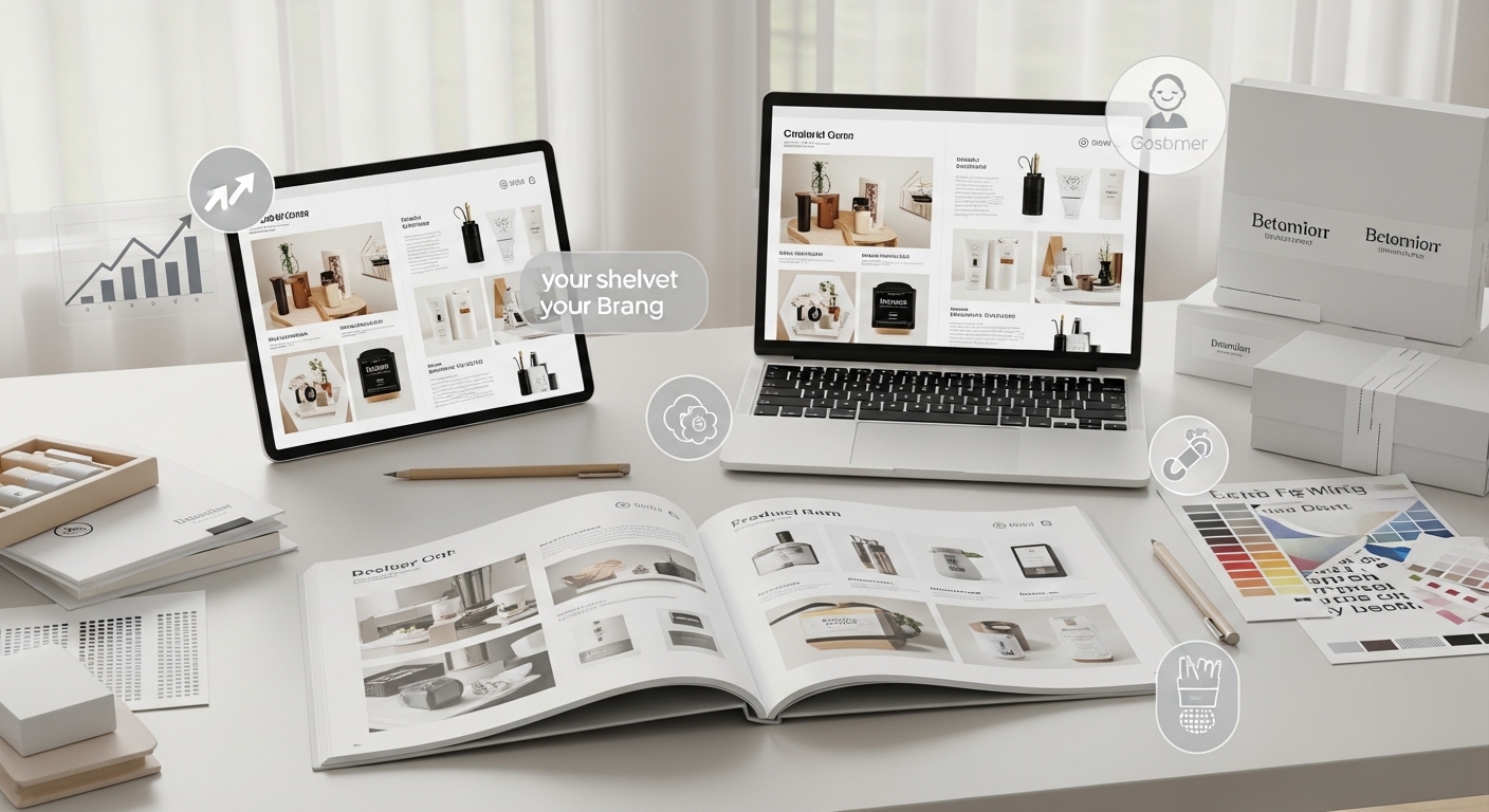
Print vs Digital Catalog: Which One Wins?
Both have their place—and both can be powerful when designed well.
Here’s a quick comparison:
| Feature | Digital Catalog | Print Catalog |
| Accessibility | Instant, global | Limited distribution |
| Updates | Easy and fast | Costly to revise |
| Experience | Interactive | Tangible, premium feel |
| Cost | Lower long-term | Higher production cost |
The smartest brands don’t choose one—they align both.
A printed product catalog builds brand prestige.
A digital catalog drives accessibility and conversions.
Together, they create a complete brand experience.
The Psychology Behind Catalog Design
Great catalogs don’t just organize products—they influence behavior.
Here’s how:
- Anchoring: Showing a higher-priced product first makes others feel more affordable
- Social proof: Highlighting “bestsellers” reduces decision anxiety
- Scarcity: “Limited stock” creates urgency
- Contextual display: Showing products in use increases desirability
These aren’t tricks—they’re behavioral insights applied through design.
How to Build a Product Catalog That Actually Works
Building a product catalog that performs well is not about assembling products onto pages—it is about engineering a guided buying experience. A strong catalog reduces confusion, builds confidence, and moves the customer toward a decision without friction. If you are starting from scratch or redesigning an existing catalog, the process needs to be intentional from the beginning.
Step 1: Understand Your Audience
Every effective catalog starts with a clear understanding of who it is built for. Without this, even a visually strong catalog can feel disconnected from how people actually browse and make decisions.
Customers do not all behave the same way. Some browse with a specific product in mind, while others explore based on category, price, or inspiration. If the catalog does not reflect these behaviors, it creates unnecessary friction.
At this stage, the focus should be on identifying:
- What customers are trying to achieve when they enter the catalog
- How quickly they expect to find relevant products
- What information they need before making a decision
- Where confusion or hesitation typically occurs
When these patterns are understood, the catalog can be structured around real behavior instead of assumptions. This makes every other step more effective.
Step 2: Define a Clear Structure
Once the audience is understood, the next step is translating that insight into structure. A catalog without a clear structure feels chaotic, even if the products themselves are strong.
Structure determines how easily a user can move from general browsing to specific selection. This includes categories, subcategories, filters, and overall navigation flow.
The goal is to make the catalog feel intuitive from the first interaction. Users should not have to think about where to go next—it should feel obvious.
A strong structure:
- Groups products based on customer intent rather than internal organization
- Uses clear, descriptive category names
- Maintains consistency across sections
- Allows users to narrow choices without feeling restricted
When structure is clear, users stay engaged longer and move through the catalog with confidence.
Step 3: Invest in Visual Quality
Visual quality is one of the most critical factors in catalog performance. In a digital or printed catalog, the customer cannot physically interact with the product. That means visuals must carry the entire burden of presentation.
Low-quality images immediately reduce trust. They create uncertainty about the product, which leads to hesitation or abandonment.
High-quality visuals, on the other hand, create clarity and confidence. They allow the customer to understand the product quickly and imagine using it.
This includes:
- Sharp, high-resolution images
- Consistent lighting and backgrounds
- Clear representation of product details and scale
- Contextual images that show real-world use
Visual quality is not an enhancement—it is a requirement. Even the best products struggle to sell if they are poorly presented.
Step 4: Create a Design System
Consistency in a catalog does not happen by chance. It is the result of a defined design system that governs how every page looks and behaves.
Without a system, catalogs quickly become inconsistent. Fonts change, layouts shift, and visual styles vary from page to page. This creates a fragmented experience that feels unstructured and unprofessional.
A design system ensures that:
- Typography remains consistent across all sections
- Colors align with brand identity
- Layout patterns repeat in a predictable way
- Image styles remain uniform
This consistency reduces cognitive load. The user does not need to adjust to new visual rules on each page, which makes browsing smoother and more focused.
Over time, this also builds trust. A consistent catalog feels more reliable and intentional.
Step 5: Optimize for Conversion
Many catalogs are designed to display products, but not to guide decisions. This is where conversion optimization becomes important.
A high-performing catalog does not leave the user to figure things out alone. It subtly directs attention and simplifies choices.
This involves:
- Highlighting key products instead of treating everything equally
- Reducing unnecessary options at each stage
- Making important information easy to find
- Providing clear next steps toward purchase
The goal is not to push the customer aggressively, but to remove friction from the decision process. When users feel guided rather than overwhelmed, they are more likely to convert.
Step 6: Continuously Improve
A catalog is not a one-time project. Once it is launched, real user behavior begins to reveal what works and what does not.
Tracking how users interact with the catalog provides valuable insight. This includes:
- Which categories attract the most attention
- Where users drop off
- Which products receive the most engagement
- How long users spend browsing
This data should be used to refine the catalog over time. Small adjustments in structure, presentation, or layout can lead to significant improvements in performance.
Continuous improvement ensures that the catalog evolves alongside customer behavior rather than becoming outdated.
The Long-Term Impact on Your Brand
A well-designed product catalog compounds over time.
It:
- Builds brand authority
- Improves customer retention
- Reduces bounce rates
- Increases average order value
It becomes more than a catalog—it becomes part of your brand’s foundation.
Frequently Asked Questions (FAQ)
What is a product catalog in eCommerce?
A product catalog in eCommerce is a structured collection of all products a business offers, including images, descriptions, pricing, and categories. It acts as the primary interface between the customer and the brand’s offerings.
Why is catalog design important for brand growth?
Strong catalog design improves user experience, builds trust, and increases conversions. It also reinforces brand identity and supports marketing efforts across multiple channels.
What makes a good digital catalog?
A good digital catalog is easy to navigate, visually consistent, mobile-friendly, and optimized for conversions. It should guide users toward decisions rather than overwhelm them with options.
How often should a product catalog be updated?
Digital catalogs should be updated regularly—whenever products, pricing, or inventory changes. Print catalogs are typically updated seasonally or annually.
Can a product catalog improve SEO?
Yes. A well-structured eCommerce catalog with optimized product pages, relevant keywords, and clear categorization improves search visibility and organic traffic.