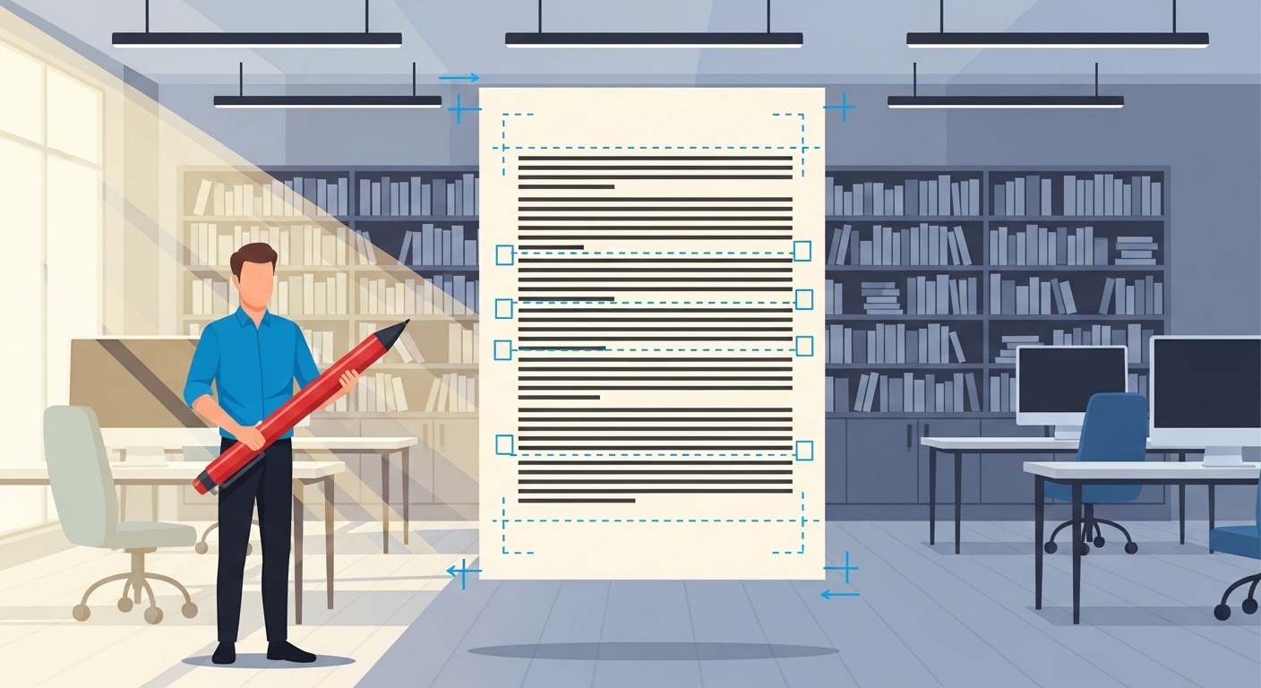
Submitting a manuscript to a literary agent is more than simply emailing your work and hoping for the best. It’s a subtle form of communication that shows you understand the rules of the publishing world, respect the agent’s time, and take your craft seriously. Imagine a stage: your story is the performance, and formatting is the stage itself. No matter how brilliant the actors are, a cluttered, unstable, or chaotic stage can undermine the entire production. Conversely, a clean, professional stage allows your story to shine, pulling the audience into your world without distraction.
Formatting might feel like an arbitrary technical hurdle, but it communicates more than you might think. It signals discipline, attention to detail, and professionalism—qualities agents value as much as the quality of your prose. After all, agents are not just investing in a single story; they’re investing in you as a writer and potentially a long-term collaborator. A manuscript that is chaotic, inconsistent, or hard to navigate may never get a fair read because the presentation creates friction where there should be flow.
In this guide, we’ll explore every aspect of manuscript formatting, from the industry-standard basics to the subtle nuances that separate a professional submission from an amateur one. You’ll learn not only what agents expect but also why these expectations exist and how to meet them with confidence.
Why Proper Formatting Can Make or Break Your Submission
At first glance, formatting may seem purely cosmetic, but in reality, it affects how an agent experiences your work. Literary agents often juggle hundreds of manuscripts simultaneously, reading dozens of submissions every week. When a manuscript is visually chaotic—crowded text, inconsistent spacing, missing page numbers—it signals carelessness or inexperience before they even read the first line. Even if your story has a brilliant concept or beautifully written characters, poor formatting can prevent your work from getting the attention it deserves.
Proper formatting serves three critical purposes. First, it enhances readability, allowing agents to immerse themselves in your story without distraction. Second, it facilitates annotation and reference, making it easier for an agent to mark passages or discuss specific sections with editors. Finally, it signals professionalism, showing that you understand industry norms and respect the agent’s time. A manuscript that is neat, consistent, and polished immediately conveys that the writer knows what they are doing and is serious about pursuing publication.
Ultimately, formatting is not just a matter of rules—it’s a strategic tool. It creates a seamless reading experience, freeing your story to make its impact without being undermined by technical issues. When done correctly, it allows the agent to focus entirely on your prose, plot, and characters, giving your manuscript the best chance of standing out in a crowded field.
The Industry-Standard Basics Every Manuscript Must Follow
Absolutely! That section can be broken down into subheadings (H3s) to make it easier to read while maintaining a detailed, narrative style. Here’s the revised version:
Choosing the Right Font and Size
Before an agent even reads your words, the font and size set the tone for your manuscript. The industry standard favors simple, highly readable fonts like Times New Roman or Courier, set at 12-point size. Decorative or unconventional fonts may seem fun, but they can distract the reader and, in some cases, create compatibility issues when your file is opened on different devices. Think of your font choice as the dress code for your manuscript: you want it polished, professional, and easy to engage with.
Spacing That Enhances Readability
Proper spacing is more than a stylistic preference—it’s a matter of readability. Double-spacing your manuscript gives agents room to annotate, digest, and navigate your story without fatigue. Single-spaced text or inconsistent line spacing can make the manuscript feel cramped and overwhelming, creating friction between your work and the reader. Proper spacing keeps the eyes moving smoothly across the page and ensures that the story, not the formatting, is the focus.
Margins That Give Your Pages Room to Breathe
Margins may seem like a minor detail, but they profoundly affect readability. Setting one-inch margins on all sides prevents the text from feeling claustrophobic and provides space for notes or comments. Crowded pages are harder to follow and may subconsciously suggest a lack of attention to detail. By giving your text room to breathe, you make the reading experience more comfortable and professional.
Paragraphs and Alignment
Paragraph formatting affects both the visual flow and the pace of your story. Industry norms dictate that the first line of each paragraph should be indented by half an inch, without adding extra blank lines unless signaling a scene break. Left-aligned text is preferred, as fully justified text can create uneven gaps that disrupt the reading rhythm. Consistent paragraph indentation and alignment not only look professional but also allow agents to read smoothly without distraction.
Page Numbers: Small Detail, Big Difference
Page numbers are a subtle yet essential element. Including them in a header or footer allows agents to reference specific sections quickly, whether during discussions with editors or while making notes. A manuscript without page numbers may seem incomplete or careless, so this small detail plays an outsized role in projecting professionalism.
Scene Breaks That Maintain Flow
Scene breaks are critical for signaling shifts in time, location, or perspective. Whether you choose a centered “#” or a line of three asterisks, these markers guide the reader without interrupting the narrative. Inconsistent or unclear scene breaks can confuse the agent and disrupt the pacing of your story. Properly formatted scene breaks maintain narrative momentum and make your manuscript easier to navigate, demonstrating your attention to storytelling craft as well as presentation.
Your Title Page: More Than Just a Cover Sheet
The title page is the first formal interaction an agent has with your manuscript, and it sets the tone for the rest of the submission. A strong title page is concise, clear, and professional. It communicates your name, the book title, and essential contact information, all while adhering to industry norms.
The title itself should be prominent and centered. Some writers opt for all caps or bold formatting, which is acceptable as long as it remains consistent throughout the manuscript. If your book has a subtitle, it can be included directly below the main title. Below that, include your author name, the one you intend to publish under. At the bottom corners of the page, include your contact information on the left and the word count on the right. This simple structure ensures that the agent has all the information they need without sifting through unnecessary details.
Avoid decorating your title page with logos, images, or elaborate fonts. Clarity and professionalism are far more compelling than gimmicks. Think of this page as a handshake—it introduces both you and your story and demonstrates that you understand the conventions of the publishing industry.
Chapters That Invite Readers In
Chapters are more than just structural markers; they shape the rhythm of your story and guide the reader through your narrative. Properly formatted chapters help the agent navigate your manuscript with ease and give the story a sense of structure and professionalism.
Chapter headings should be centered and consistently formatted, whether you choose “CHAPTER ONE” or “Chapter 1: Title.” Consistent spacing before and after chapter headings prevents the page from feeling cluttered. Within chapters, scene breaks signal shifts in time, location, or point of view. A simple centered symbol, like “#” or three asterisks, works best. Irregular headings or inconsistent spacing can confuse readers and distract from the story itself.
When an agent opens your manuscript, they are subconsciously evaluating your ability to maintain clarity and rhythm across hundreds of pages. Clean, consistent chapter formatting communicates that you are a disciplined writer who understands how to guide a reader smoothly through a story.
Dialogue Done Right: Letting Characters Speak Clearly
Dialogue is the lifeblood of character-driven storytelling, but poorly formatted dialogue can make even the most compelling exchanges difficult to follow. Standard conventions exist for a reason—they improve readability and keep the focus on the characters and their interactions.
Each new speaker should start a new paragraph, and dialogue should be enclosed in standard double quotation marks. Keep dialogue tags simple, using “he said” or “she asked” rather than overly descriptive adverbs. Correct punctuation, such as placing commas and periods inside quotation marks, is essential.
For example, consider the following interaction:
“I can’t believe you actually did that,” she whispered.
“It had to be done,” he replied.
This formatting makes the dialogue easy to read and allows the agent to absorb both the voice and rhythm of your characters without confusion.
Scene Transitions That Maintain Momentum
Scene transitions are subtle but vital. Agents must follow shifts in time, perspective, or location without being jarred out of the story. A clearly defined scene break allows the narrative to breathe and signals to the reader that a new focus is beginning.
Centered symbols like “#” or three asterisks are standard, and consistency is key. Avoid verbose labels like “End Scene” or uneven spacing. Properly formatted scene breaks enhance pacing and keep the story flowing, making the manuscript more enjoyable and professional from the first page to the last.
File Type and Naming: Details That Reflect Professionalism
Even the digital file itself carries weight. Most agents prefer Word documents (.doc or .docx) because they are universally accessible and allow for easy annotation. PDFs are generally acceptable only if specifically requested.
File naming is equally important. Include the book title and your name in the file name—for instance, The_Wandering_Star_Jane_Doe.docx. A clearly labeled file makes it easier for agents to organize and track submissions, which may seem small but can make a lasting impression of professionalism and attention to detail.
Avoiding Common Formatting Pitfalls
Even experienced writers make mistakes that can hurt their chances with agents. Common pitfalls include single-spacing text, decorative or unconventional fonts, inconsistent paragraph indentation, excessive blank lines between paragraphs, and irregular scene breaks. Each of these errors, while seemingly minor, disrupts the reading experience and can create a negative impression before the agent even engages with your story.
Why Agents Care About Formatting
It might seem that agents only care about the story itself, but presentation affects perception. A well-formatted manuscript reduces visual clutter, improves readability, and allows the agent to focus entirely on the story rather than technical distractions. Clean formatting signals professionalism, discipline, and respect for the reader, qualities that agents seek in a writer they intend to represent.
Tips for Maintaining Consistency Across Hundreds of Pages
Maintaining formatting consistency across a full manuscript is challenging but manageable. Modern word processors allow you to define paragraph and heading styles, ensuring that spacing, fonts, and indents remain consistent throughout. Setting defaults at the start of your manuscript prevents errors from accumulating, and a careful proofread—or professional formatting review—can catch inconsistencies before submission.
Frequently Asked Questions About Manuscript Formatting
What font and size should I use?
Times New Roman or Courier, 12-point is standard.
Should I include page numbers?
Yes, include them in the header or footer for easy reference.
How do I format scene breaks?
Centered symbols such as “#” or three asterisks work best; avoid labels like “Scene Two.”
Should I submit a PDF or Word document?
Word (.doc or .docx) is preferred. PDFs are acceptable only if requested.
Can I include images or graphics?
Generally no, unless your work is heavily illustrated, such as a picture book.
Final Thoughts: Let Your Story Shine Through Clean Formatting
Formatting might feel like a technical hurdle, but it is a critical component of presenting your manuscript professionally. A well-formatted manuscript ensures readability, demonstrates professionalism, and removes obstacles that might prevent your story from being taken seriously. From fonts and spacing to chapter headings, dialogue, and scene breaks, every detail counts.
Think of formatting as invisible scaffolding supporting your story. When done well, it allows the words, characters, and narrative to stand center stage and perform at their best. In the competitive world of publishing, polished formatting is not just a nicety—it could make the