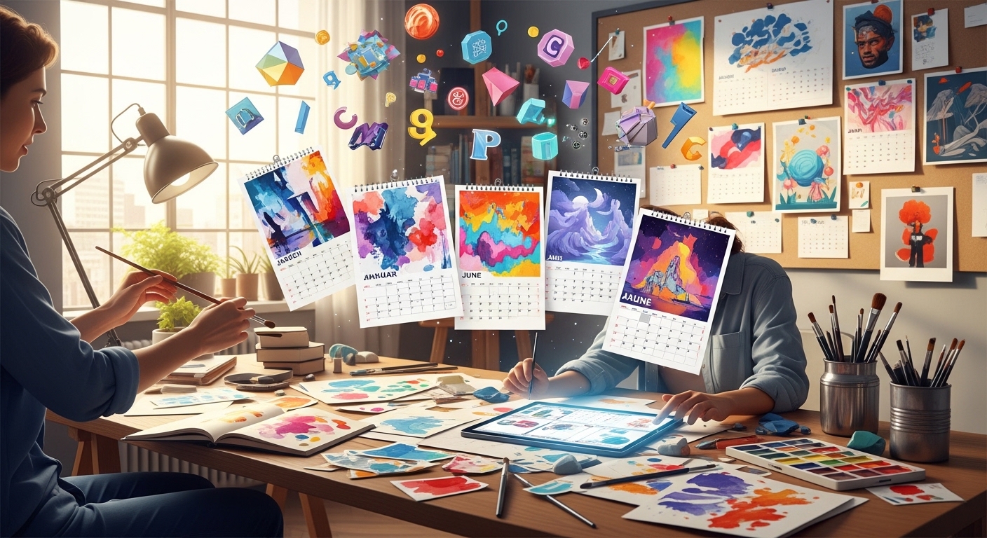
An art calendar is one of those rare creative projects that sits at the intersection of design, utility, and personal expression. It is not just a way to track days—it becomes a curated visual experience that unfolds month by month. When designed thoughtfully, it transforms a functional object into something people actually look forward to using every day.
In 2026, the idea of a calendar has expanded far beyond its traditional role. Digital tools dominate scheduling, yet physical and custom-designed calendars are seeing renewed appreciation. They offer something screens cannot: presence. A well-designed art calendar brings emotion into routine timekeeping. It becomes part of a desk, a wall, a workspace, and in many cases, a personal or brand identity statement. Before jumping into techniques and design tips, it is important to understand what makes an art calendar meaningful in the first place and why its design requires more intention than it initially appears.
Understanding What an Art Calendar Really Represents
An art calendar is not simply a grid of dates paired with images. At its core, it is a structured storytelling. Each month becomes a visual chapter, and together they form a cohesive creative journey. Unlike posters or standalone artwork, a calendar requires rhythm. It must balance consistency with variation. Every page needs to stand on its own visually while still feeling connected to the rest of the collection.This dual requirement is what makes calendar design uniquely challenging. You are not designing one piece—you are designing twelve interconnected experiences that must function both individually and collectively.
An effective art calendar also lives in two spaces at once: aesthetic and functional. It must be visually appealing while remaining easy to read and practical to use. If either side is neglected, the entire experience weakens.
Understanding this balance is the foundation for everything that follows.
Why Designing an Art Calendar Feels More Complex Than It Looks
At first glance, designing a calendar may seem straightforward. You place dates, add artwork, and arrange the layout. But once the process begins, complexity quickly emerges.
The challenge lies in alignment—visual, structural, and conceptual. Each month has different spacing requirements due to varying days. Each artwork must adapt to different layouts. Typography must remain readable without overpowering visuals. And the overall design must maintain a consistent identity across all pages. There is also an emotional layer. A calendar is experienced over time, not all at once. That means pacing becomes important. Some months may feel energetic, others calm, but the transition between them must still feel intentional.
A successful calendar does not just display time—it shapes how time is visually experienced.
The Importance of a Strong Concept Before Design Begins
One of the most overlooked aspects of calendar design is concept development. Many designers start directly with visuals, but without a guiding concept, the final result often feels disconnected.
A strong concept acts as the invisible thread connecting all twelve months. It could be based on seasons, moods, artistic styles, personal memories, cultural themes, or abstract visual progression. Without this conceptual backbone, even high-quality artwork can feel like a random collection rather than a unified product. A useful way to think about concept development is to imagine the calendar as a journey rather than a set of pages. Each month should feel like a destination within a larger story.
Transitioning From Idea to Execution
Once the concept is defined, the natural next step is execution. But this transition is where many designers lose direction. The shift from abstract thinking to practical design often leads to inconsistency, especially when multiple visual elements are introduced without structure.
Before diving into actual design decisions, it is important to pause and establish a clear framework. This includes understanding how artwork, typography, spacing, and layout will interact across all twelve months.
At this stage, the focus shifts from “what should it look like?” to “how should it function as a complete system?” This is also where many successful designers begin building visual rules. These rules are not restrictions—they are stabilizers that ensure consistency throughout the entire calendar. With this foundation in place, the design process becomes significantly more controlled and intentional.
Establishing Visual Consistency Across All Months
Consistency is one of the most critical elements in calendar design. Without it, the project feels fragmented and unstructured.
Typography as a unifying element
Typography plays a major role in creating cohesion. Using consistent font families, sizes, and spacing across all months ensures that the calendar feels like a single product rather than separate pages.
Even small inconsistencies in font weight or alignment can disrupt the overall experience.
Layout structure as a visual anchor
Each month should follow a recognizable layout structure. This does not mean every page must look identical, but there should be a clear system in place that guides placement of dates, artwork, and supporting elements. When layout structure is consistent, the reader naturally understands how to interact with each page.
Color as a controlled narrative tool
Color should not be random. It should follow a deliberate system—whether seasonal transitions, emotional progression, or thematic variation.
When used correctly, color can subtly guide the viewer through the calendar’s conceptual journey.
Designing Artwork That Works Within a Calendar Format
Art in a calendar cannot function in isolation. Unlike gallery pieces, it must coexist with dates, grids, and functional elements.
Balancing artwork and functionality
One of the biggest challenges is ensuring that artwork does not get visually interrupted by calendar elements. At the same time, the dates must remain clearly readable.
This requires careful composition planning before finalizing any visual piece.
Adapting art to different layouts
Each month presents a different structural challenge. Some months may require more vertical space, others more horizontal balance. Artwork should be adaptable enough to work within these constraints without losing its identity.
Maintaining visual hierarchy
The viewer should always know where to look first. Typically, artwork is the focal point, while dates and details remain secondary. If this hierarchy becomes unclear, the calendar loses its effectiveness.
Structuring the Calendar for Real-World Use
An art calendar is still a functional object, which means usability matters as much as aesthetics.
Date readability and spacing
Dates should be clear at a glance. Overly stylized typography or crowded spacing reduces usability. The goal is to enhance readability without distracting from the artwork.
Navigation and orientation
Users should be able to quickly understand the structure of each month. Clear alignment, consistent positioning of days, and predictable layout patterns improve usability significantly.
Print practicality considerations
Design must account for real-world printing limitations. Margins, bleed areas, and binding space all influence how the final calendar will appear once produced.
Ignoring these technical aspects can compromise even the most visually refined design.
Choosing the Right Format and Print Style
The physical format of a calendar has a direct impact on how it is experienced.
Common calendar formats
| Format Type | Best Use Case | Experience Impact |
| Wall Calendar | Home or office display | High visibility, decorative |
| Desk Calendar | Personal workspace | Functional and compact |
| Spiral Bound | Easy flipping pages | Practical and flexible |
| Poster Style | Minimal monthly display | Strong visual focus |
Each format changes how the artwork is perceived and interacted with.
Paper and finish selection
Paper quality influences both durability and visual richness. Matte finishes often create a softer, more artistic feel, while glossy finishes enhance color vibrancy.
Thicker paper adds a sense of premium quality and prevents warping over time.
Enhancing Emotional Impact Through Design Choices
A strong art calendar is not just visually appealing—it creates emotional resonance.
Creating seasonal or thematic flow
One effective approach is designing each month to reflect a broader emotional or seasonal journey. This creates anticipation as the viewer progresses through the year.
Subtle storytelling through visuals
Instead of treating each month as isolated artwork, subtle visual connections can be introduced. This might include recurring motifs, evolving color palettes, or gradual stylistic shifts.
Designing for long-term engagement
A calendar is used repeatedly, not just viewed once. This means it should reveal subtle details over time, rewarding repeated interaction.
Common Mistakes to Avoid in Art Calendar Design
Even experienced designers can overlook key issues when working on calendars.
Overcrowding visual space
Trying to include too much detail often reduces clarity. Simplicity usually creates stronger impact.
Ignoring functional readability
If users struggle to read dates or understand structure, the calendar fails its primary function.
Lack of consistency across months
Without a unifying system, the calendar feels disjointed and less professional.
Weak conceptual direction
Without a strong idea guiding the design, even beautiful artwork can feel disconnected.
FAQs
What makes an art calendar different from a regular calendar?
An art calendar focuses equally on visual storytelling and functionality, while regular calendars prioritize only scheduling.
How many artworks should I include in a calendar?
Typically, twelve primary pieces are used—one for each month—though some designs incorporate additional cover or bonus pages.
Do I need professional printing for an art calendar?
While not mandatory, professional printing significantly improves color accuracy, paper quality, and durability.
What is the most important element in calendar design?
Consistency across typography, layout, and visual style is the most critical factor.
Can I sell my custom art calendar?
Yes, many artists and designers sell calendars as part of merchandise or creative portfolios.
Conclusion
Designing an art calendar in 2026 is no longer just a design exercise—it is a complete creative system that blends structure, storytelling, and visual identity. When approached thoughtfully, it becomes more than a functional object. It becomes a year-long visual experience that interacts with people’s daily lives.
A strong calendar does not rely on complexity. It relies on clarity, consistency, and intention. When these elements come together, the result is a design that not only organizes time but also enriches it.