In the digital age, a book cover’s first and often only impression comes in the form of a tiny thumbnail on a crowded marketplace. When readers scroll through hundreds of titles, their decision to click, explore, or purchase can happen in less than a second. The challenge for authors is not just to create a beautiful cover, but one that communicates genre, tone, and professionalism clearly at a very small size.
While large print covers allow for intricate detail and subtlety, thumbnails demand clarity, contrast, and immediate visual impact. In 2026, mastering these design principles has become a critical factor for discoverability and sales. This article explores what makes a book cover successful at thumbnail size, how design elements interact with reader psychology, and strategies for authors across genres to optimize their covers for online marketplaces.
The Psychology Behind Thumbnail Design
Readers rarely analyze covers in detail; instead, they rely on instant visual cues to judge whether a book is worth exploring. This split-second evaluation involves subconscious processing of color, typography, imagery, and overall composition.
First Impressions Matter
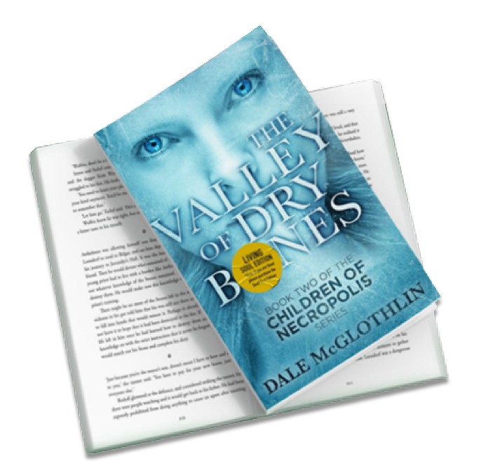
At thumbnail size, a cover must convey the book’s genre, tone, and promise immediately. For example, a thriller should signal suspense through dark tones or dramatic contrasts, while a romance novel may use soft pastels or evocative imagery. A cluttered or low-contrast cover can make the book disappear in a sea of options.
Perceived Professionalism
A clear, readable thumbnail signals professional quality. Readers are more likely to trust a book with a visually coherent, polished cover, whereas small, illegible text or poorly contrasted images can give the impression of amateurism. This subconscious judgment significantly affects click-through rates and ultimately sales.
Key Elements of a Thumbnail-Friendly Cover
Creating a cover that works at thumbnail size requires prioritizing simplicity, contrast, and hierarchy. Each element should be designed with legibility and immediate impact in mind.
Typography That Pops
Text is often the most critical component of a thumbnail cover. Titles must remain readable even at very small sizes, usually between 50–70 pixels in width on digital platforms. Using bold, sans-serif fonts or high-contrast typography ensures that readers can recognize the title and author instantly.
Tips for Typography:
- Avoid overly intricate or decorative fonts.
- Ensure sufficient spacing between letters to maintain clarity.
- Highlight the most important words (typically the main title) and reduce secondary text.
Simplified Imagery
Complex illustrations or detailed photos often lose meaning at thumbnail size. Effective covers use one focal point that conveys the essence of the story or subject matter.
For instance, a fantasy novel might feature a single magical artifact or character silhouette, while a nonfiction guide may use a clear icon or symbol representing the topic. Simplicity ensures that the image communicates meaning without visual clutter.
Contrast and Color
Contrast is crucial for legibility and impact. High contrast between text and background ensures readability, while complementary or bold colors make the cover stand out among other thumbnails. In addition, color psychology helps communicate genre and tone:
- Dark reds and blacks evoke suspense or danger.
- Pastels suggest romance or lighthearted fiction.
- Bright, saturated tones communicate energy and inspiration in nonfiction titles.
Composition Strategies for Thumbnails
The arrangement of elements on a cover influences how well it communicates at a small size. Designers focus on visual hierarchy, ensuring that the reader’s eye immediately recognizes the most important information.
Visual Hierarchy
At thumbnail size, titles should dominate, followed by imagery and the author’s name. Using a clear top-to-bottom or central layout helps readers identify key information quickly. Overcrowding or placing text over busy backgrounds reduces impact.
Framing and Focus
Framing elements, like borders or central placement of focal objects, can guide the eye and prevent a cover from appearing chaotic. For example, centering a single emblem or character against a muted background ensures that the cover communicates instantly.
Common Mistakes That Reduce Thumbnail Effectiveness
Even experienced authors and designers sometimes make mistakes that hurt cover performance in thumbnails. Understanding these pitfalls can prevent lost clicks and sales.
| Mistake | Why It Hurts at Thumbnail Size | Alternative Approach |
| Overly detailed imagery | Tiny details become indistinguishable | Focus on a single, high-impact focal point |
| Small, intricate fonts | Titles become unreadable | Use bold, high-contrast typography |
| Low contrast between text and background | Words blend into imagery | Increase contrast with solid backgrounds or outlines |
| Cluttered layout | Reader cannot quickly interpret the cover | Simplify design to emphasize one element and text hierarchy |
By avoiding these common issues, covers can maintain clarity, professionalism, and visual appeal even at small sizes.
Genre-Specific Considerations
Different genres require tailored design strategies to communicate effectively in thumbnails.
Fiction
Thrillers, romance, and literary fiction each have unique conventions. Thrillers benefit from dramatic contrasts and minimal text, romance relies on emotive imagery and pastel tones, and literary fiction often uses subtle symbolism with bold typography. The key across fiction is to ensure that the cover evokes genre expectations immediately.
Nonfiction
For self-help, business, or educational books, clarity and authority are paramount. Using clear icons, clean layouts, and bold titles communicates professionalism. Additionally, color can signal tone—blues and greens convey trustworthiness, while brighter colors energize motivational guides.
Children’s Books
Children’s thumbnails benefit from bright colors, friendly characters, and simple text. Small details must be exaggerated, and readability is essential to capture both child and parent attention.
Actionable Design Tips for Thumbnail Optimization
Designing a thumbnail-friendly cover requires intentional choices in every element. Here are some actionable strategies:
- Prioritize the title: Make it the largest element, with the author’s name secondary.
- Limit elements: Avoid multiple characters, props, or layered textures that create visual confusion.
- Test at actual size: Reduce your cover to thumbnail dimensions during the design process to ensure readability.
- Use solid backgrounds: Subtle gradients or textures are fine, but avoid busy images that obscure text.
- Maintain brand consistency: For series, use consistent fonts, colors, and layouts to encourage recognition.
FAQ – Thumbnail Cover Design
Q1: Can covers with complex illustrations still work as thumbnails?
A: Yes, but only if there’s a clear focal point and the main elements are distinguishable at small sizes. Overly detailed artwork often fails.
Q2: How important is testing at actual thumbnail size?
A: Extremely. A design may look stunning at full size but become unreadable when scaled down. Testing ensures clarity and effectiveness.
Q3: Should colors differ for thumbnails compared to print versions?
A: Often yes. Increasing contrast and saturation slightly can make covers more visible in digital marketplaces without compromising print aesthetics.
Q4: How can authors stand out among similar books?
A: Focus on a unique focal element, strong typography, and colors aligned with genre but distinctive enough to draw the eye.
Q5: Does thumbnail design affect long-term sales?
A: Absolutely. Covers that are clear, legible, and visually appealing at thumbnail size generate higher click-through rates, boosting discoverability and revenue over time.
Conclusion
In 2026, the success of a book cover depends not just on artistic beauty but on how it performs at thumbnail size. Readers judge professionalism, genre, and tone in an instant, so clarity, contrast, and simplicity are essential.
Authors who understand the psychology of thumbnails, design with legibility in mind, and tailor their covers to their genre will see higher engagement and stronger sales. Testing covers at small sizes, optimizing typography, simplifying imagery, and strategically using color can transform a good cover into a powerful marketing asset.
Ultimately, the thumbnail is the first impression that drives the reader’s journey. By prioritizing thumbnail effectiveness, authors can ensure that their books not only attract attention but also inspire readers to click, explore, and purchase.